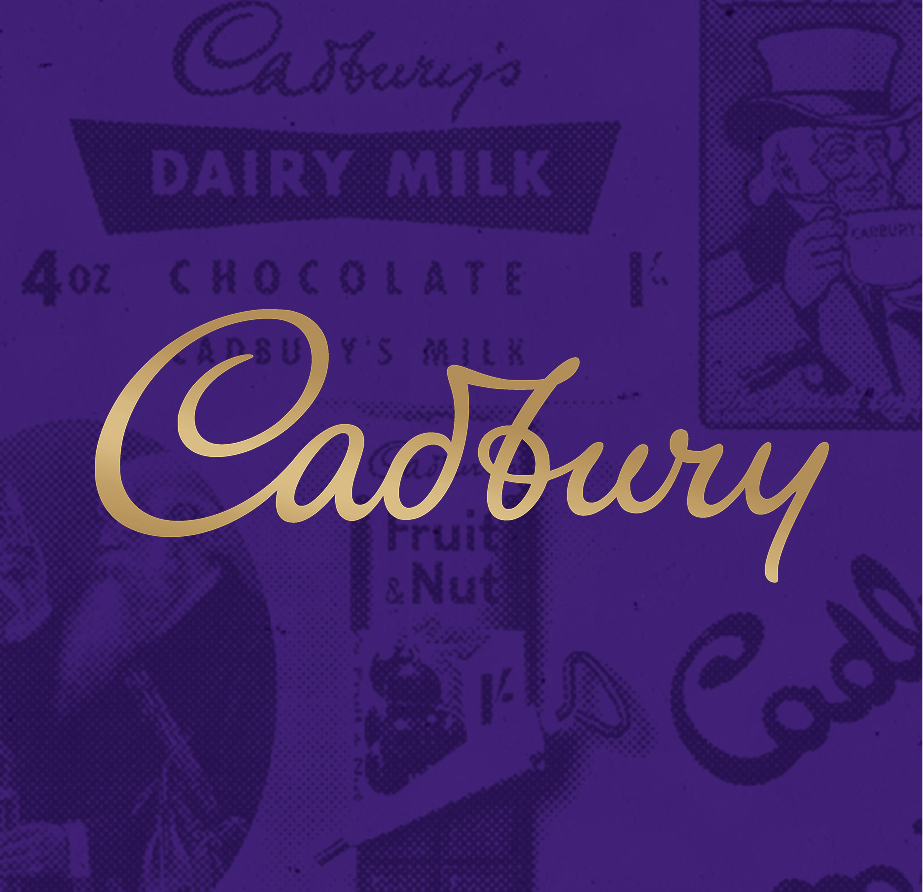
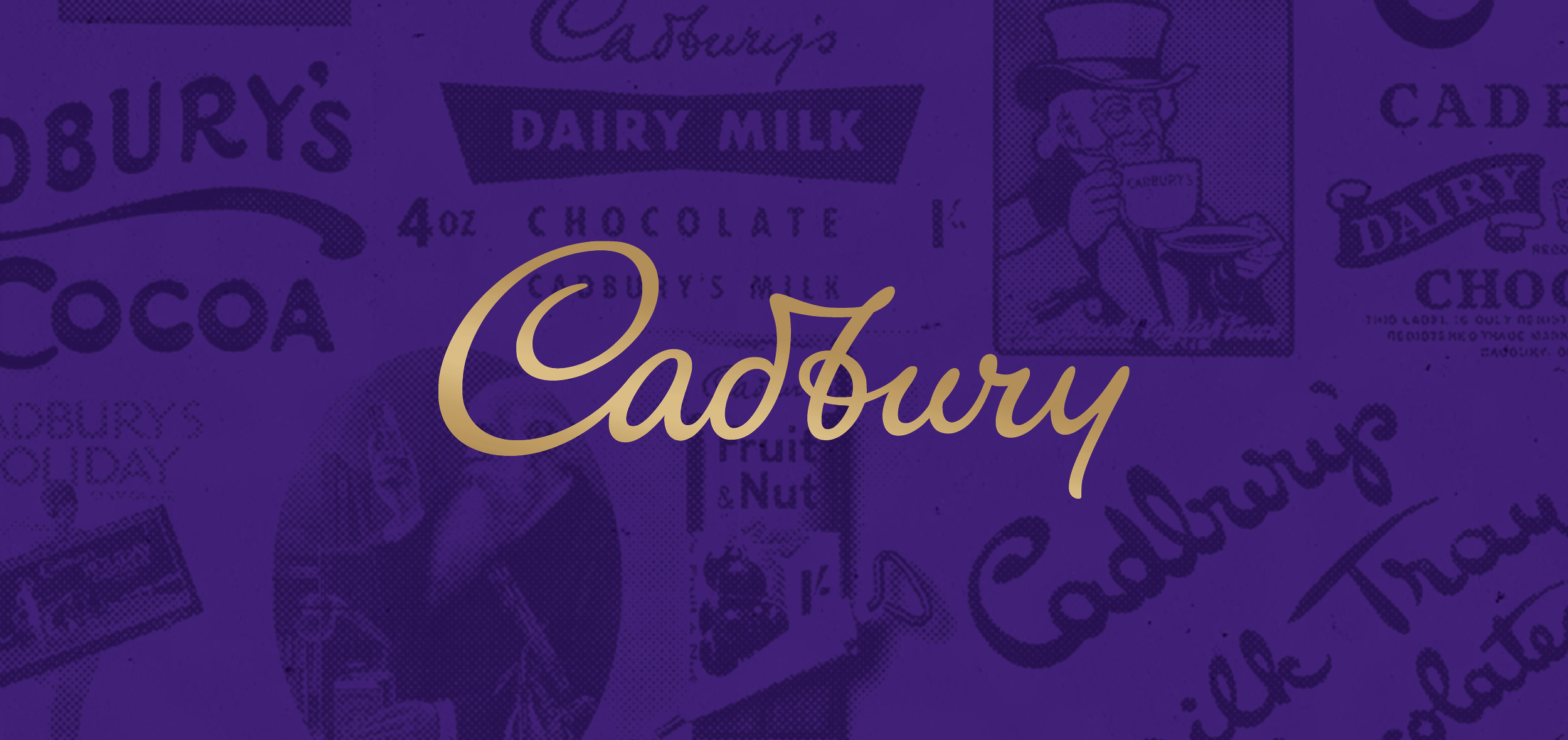
Cadbury SA
The Brief
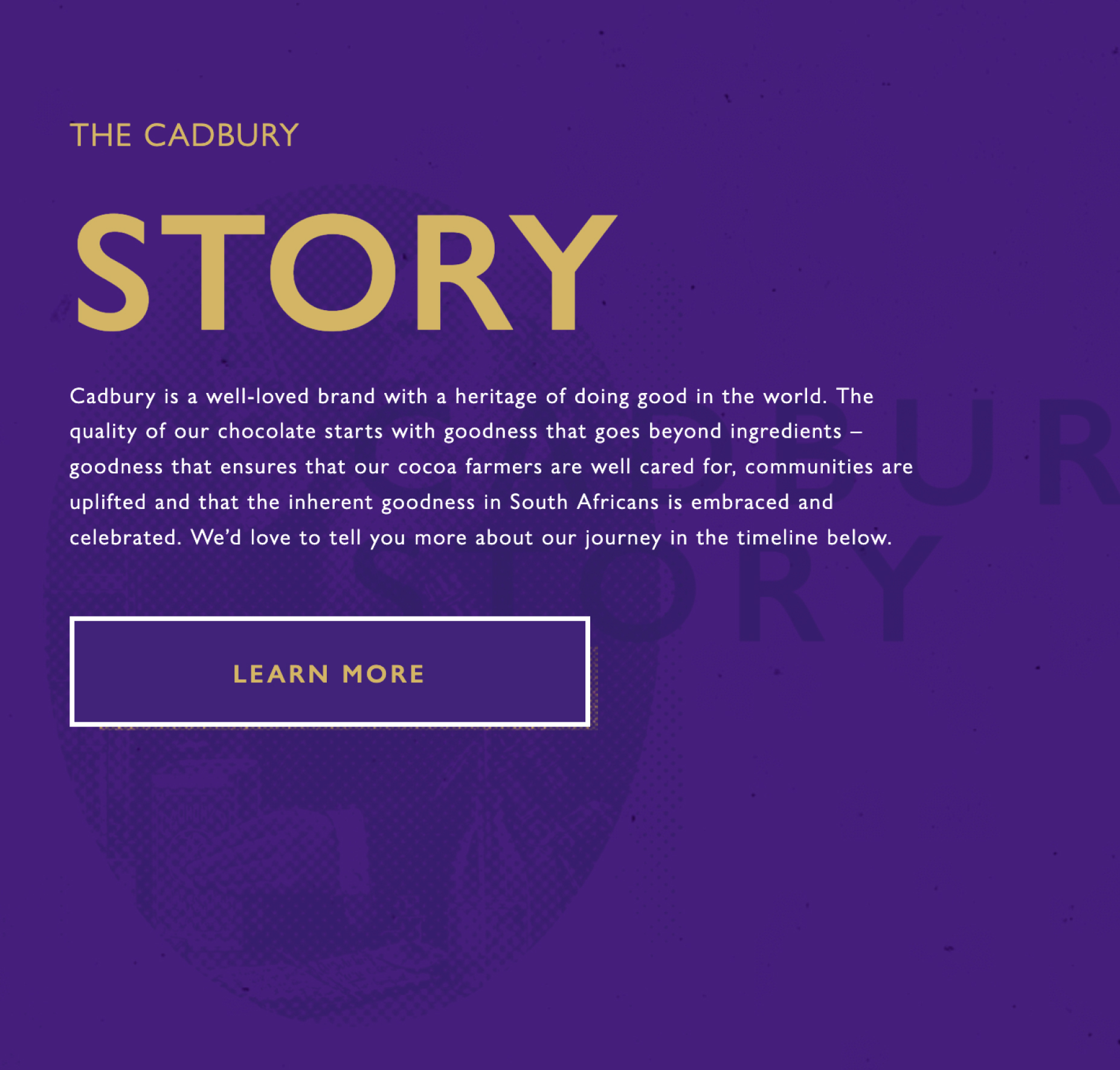
The Cadbury website was in dire need of an update. The same old website had been used for years and it had gradually become outdated from an aesthetic and technology POV as it had scaled over time. We were asked to completely overhaul the Experience Design of the website.
Take a look at the Behance case study here
* This project was completed under my contract with Ogilvy, for their client Cadbury.
Website
UI/UX
Visit Website
→
Design Process
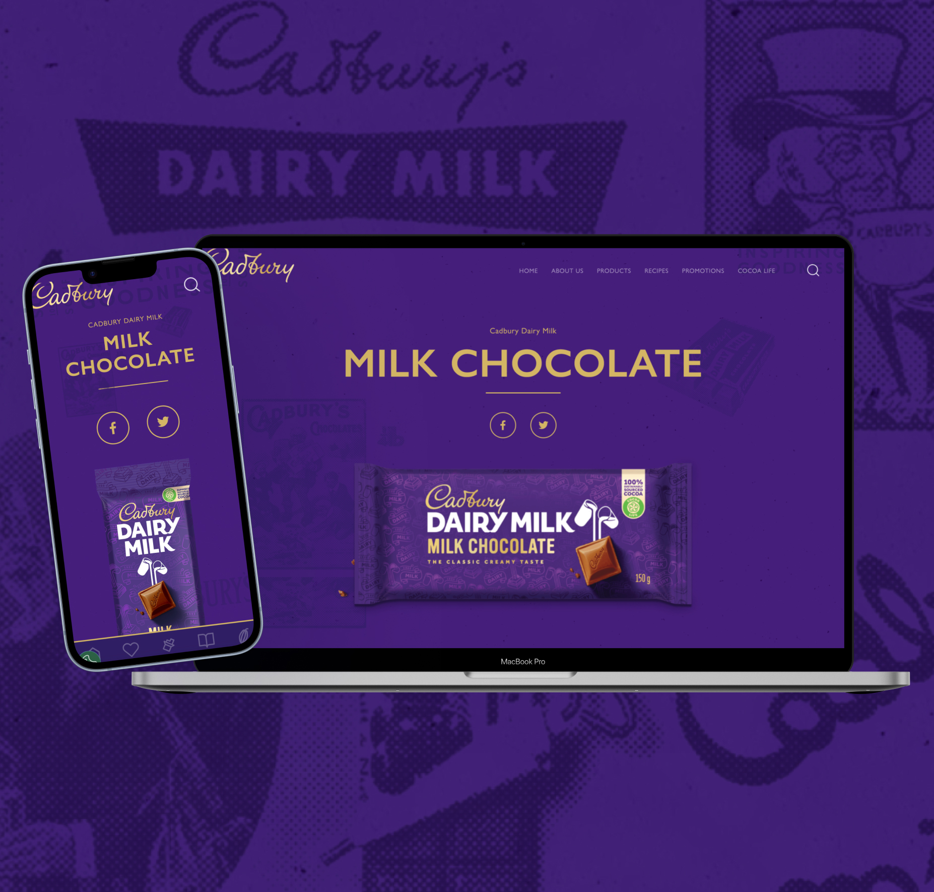
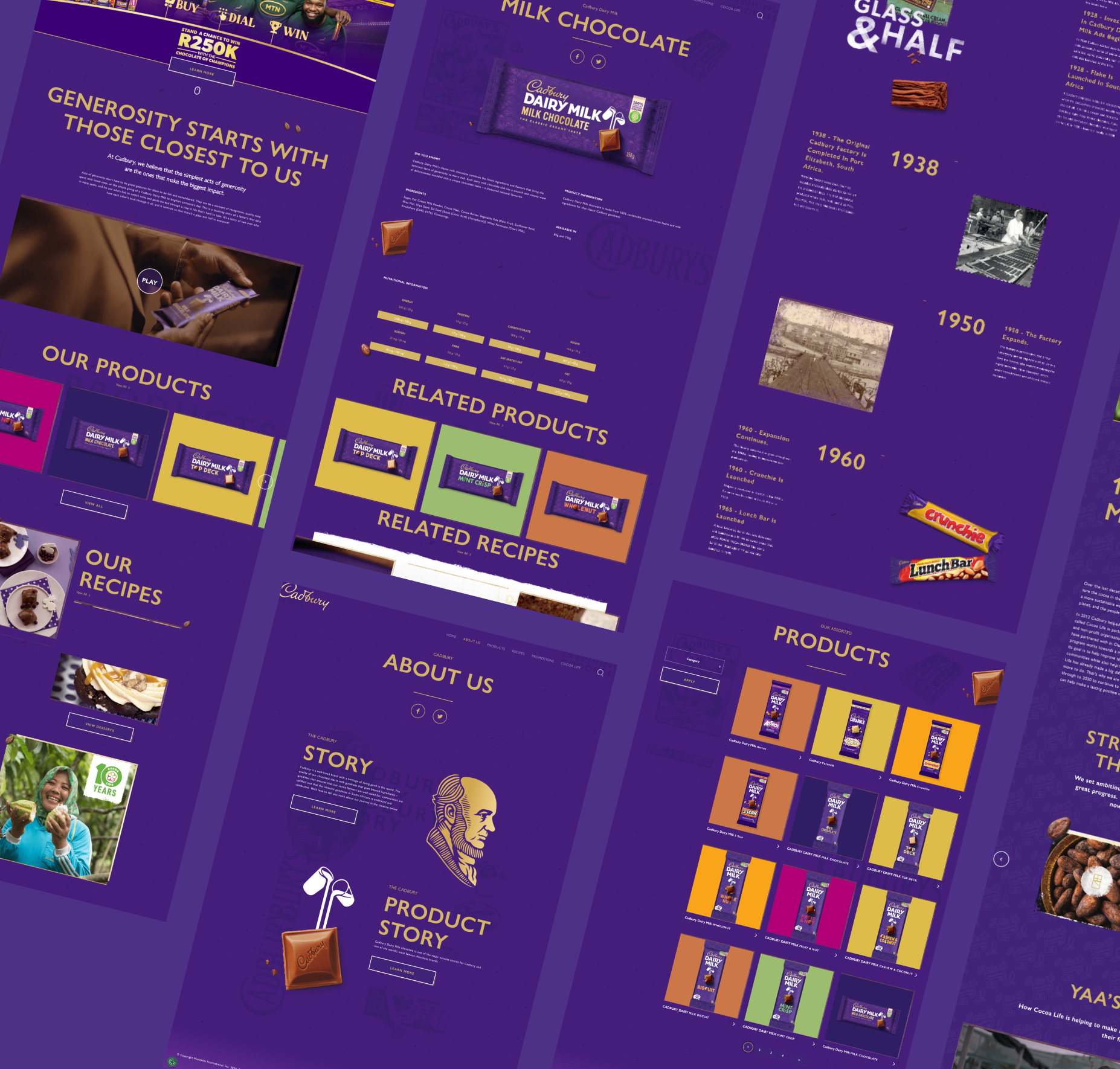
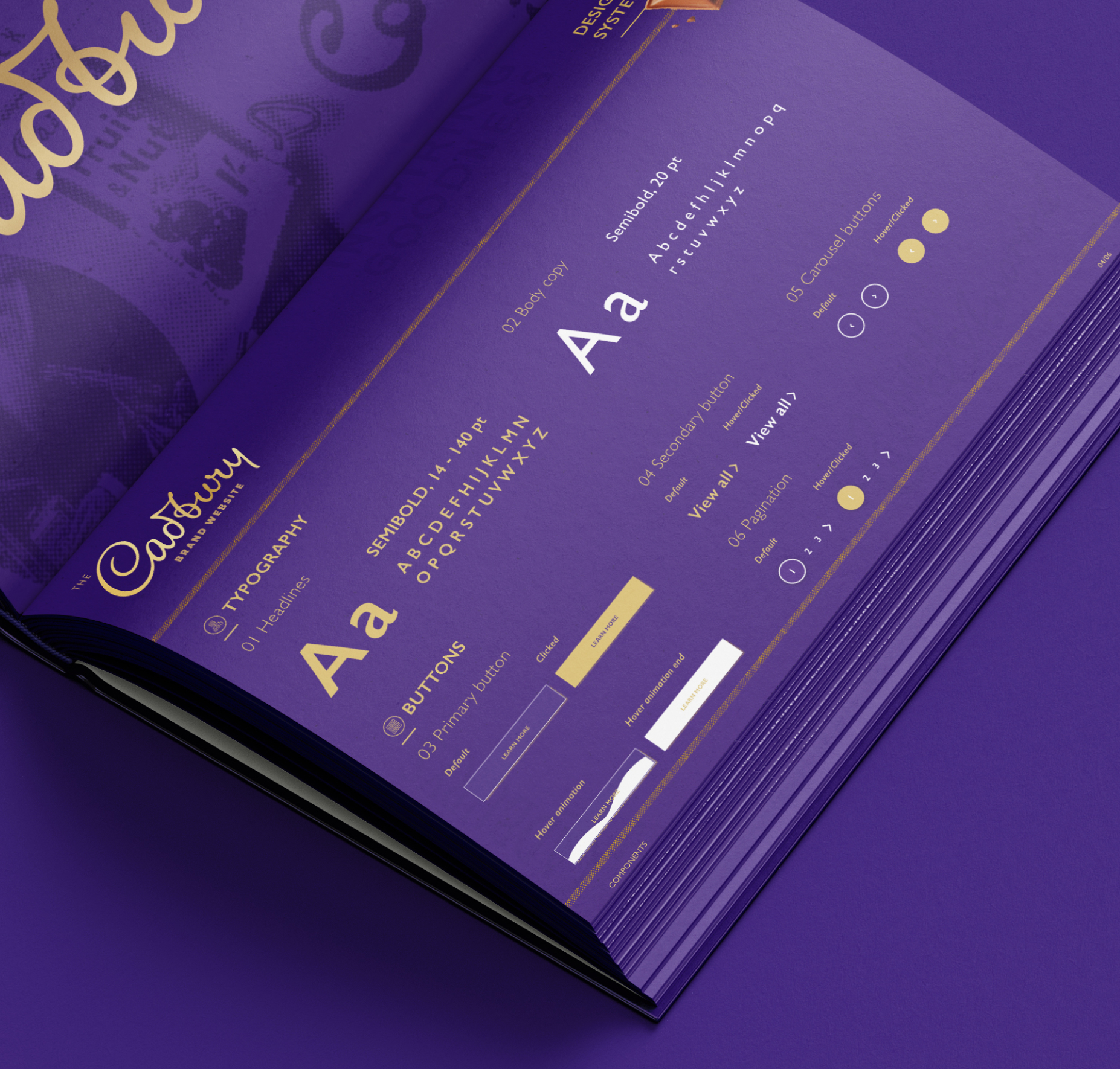
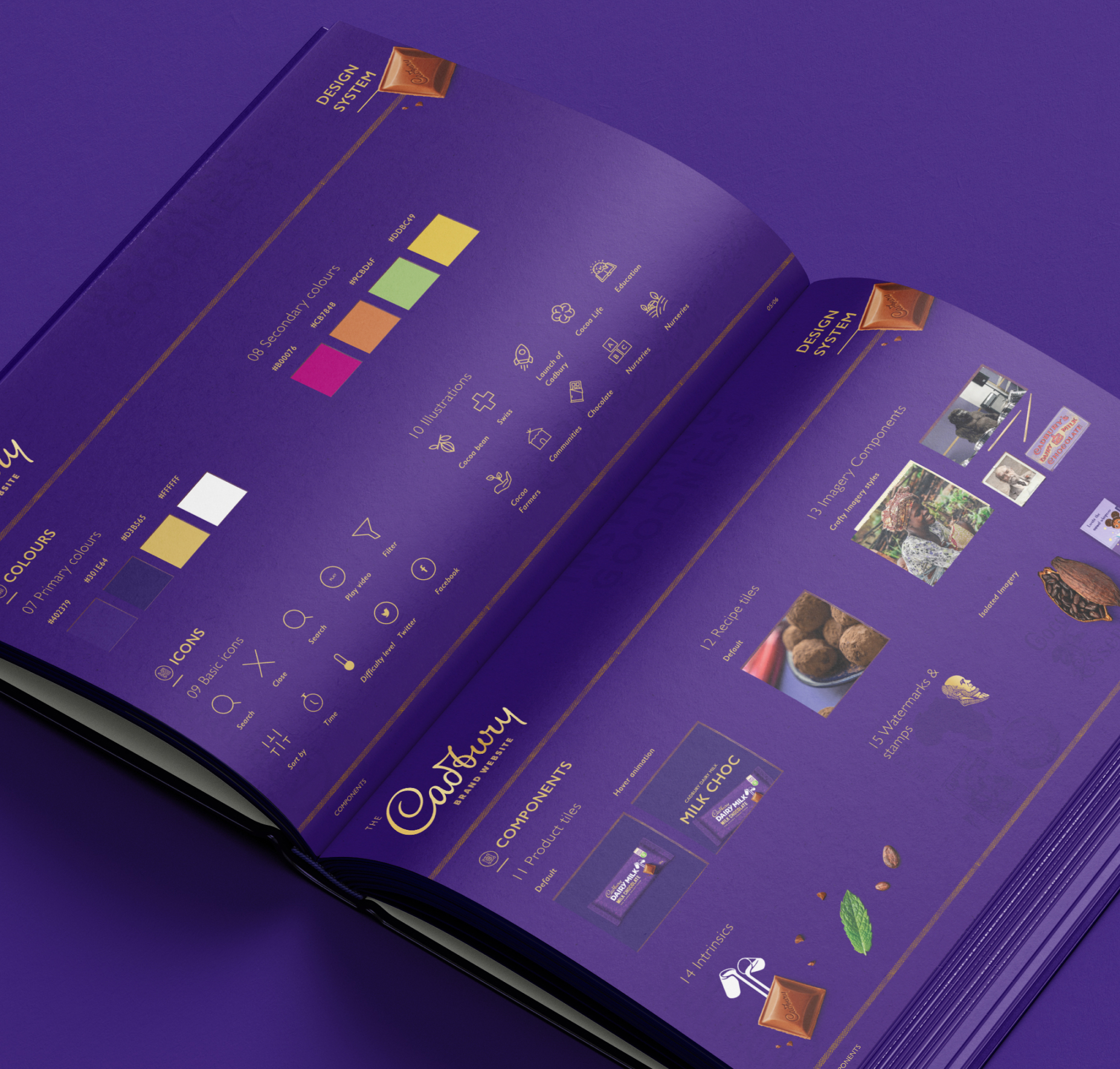
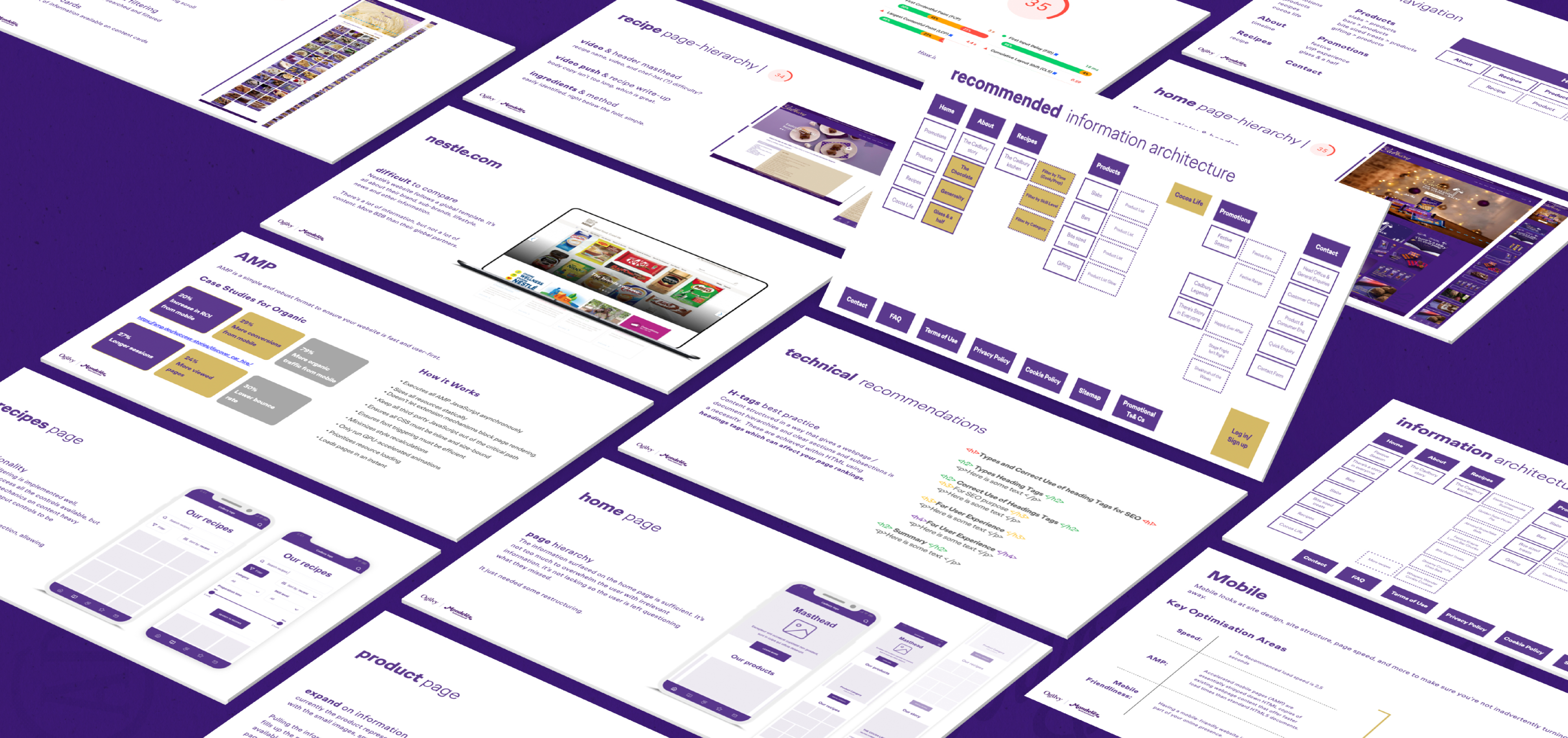
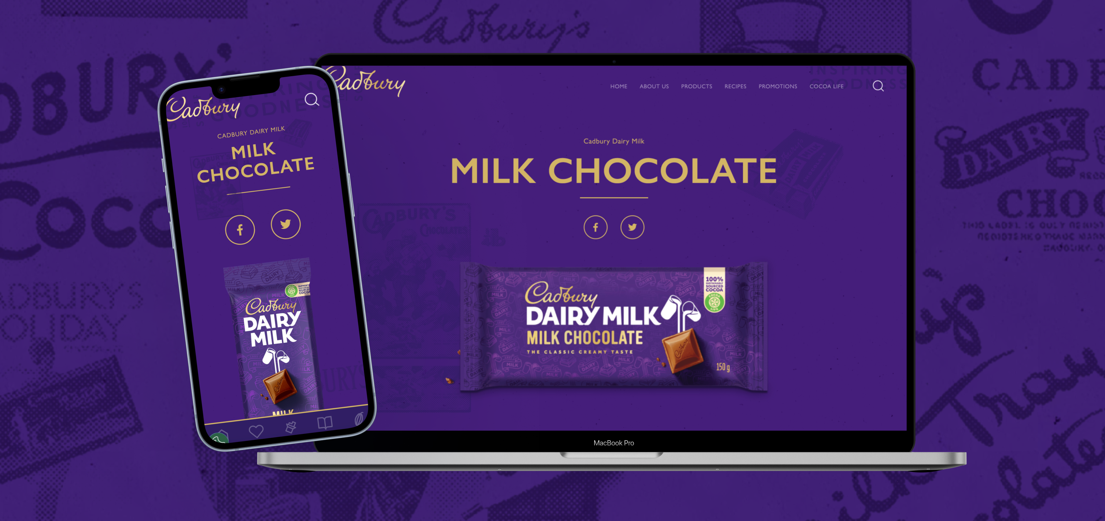
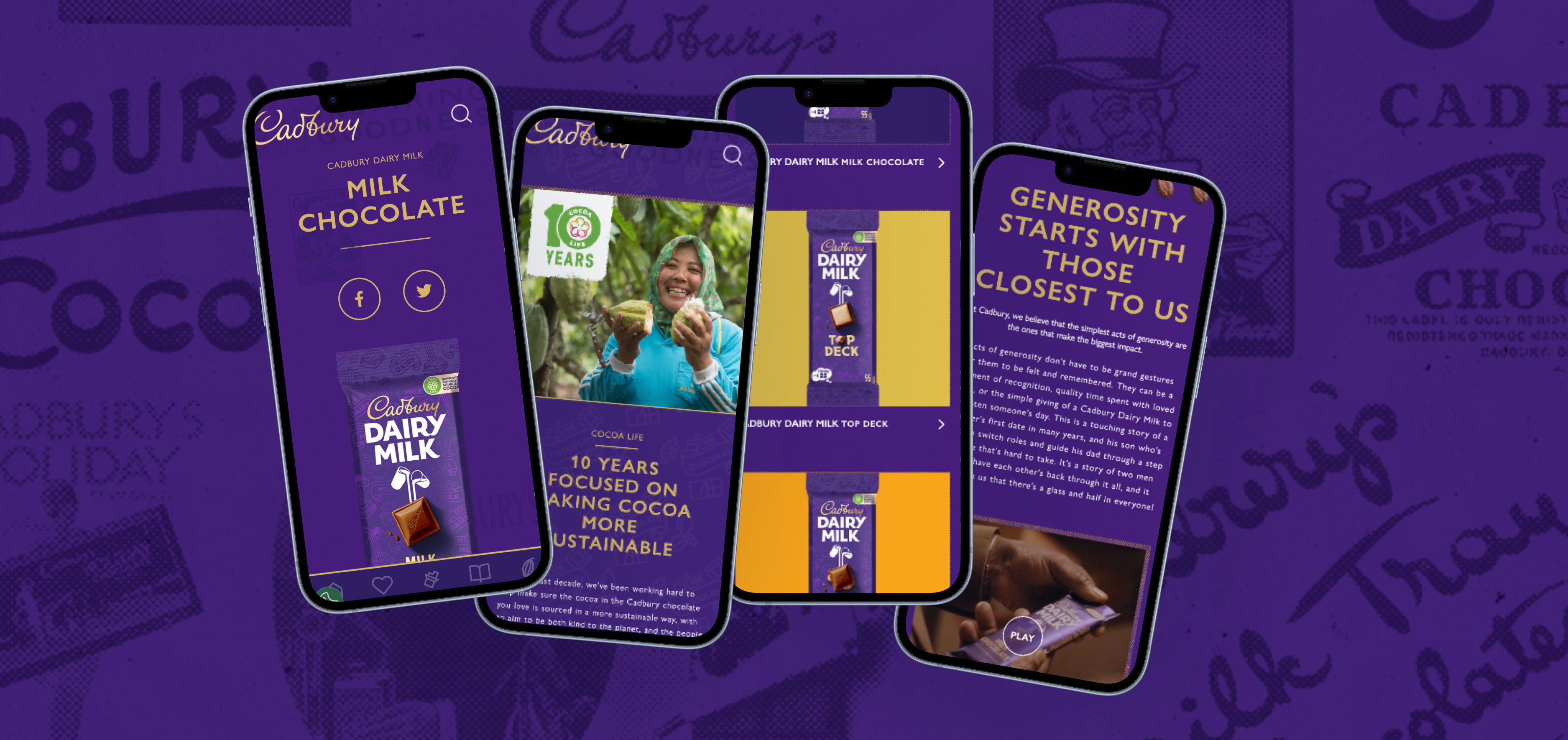
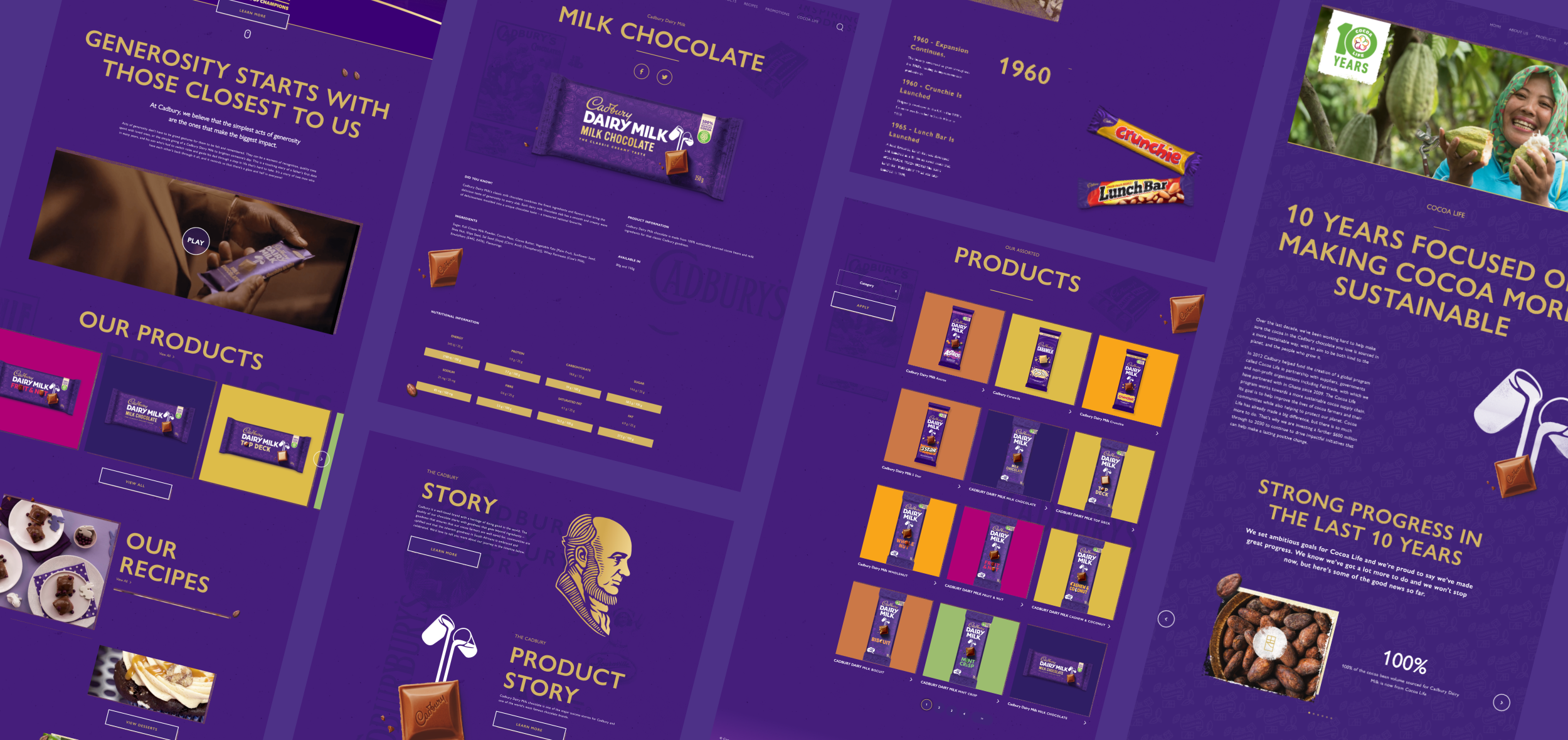
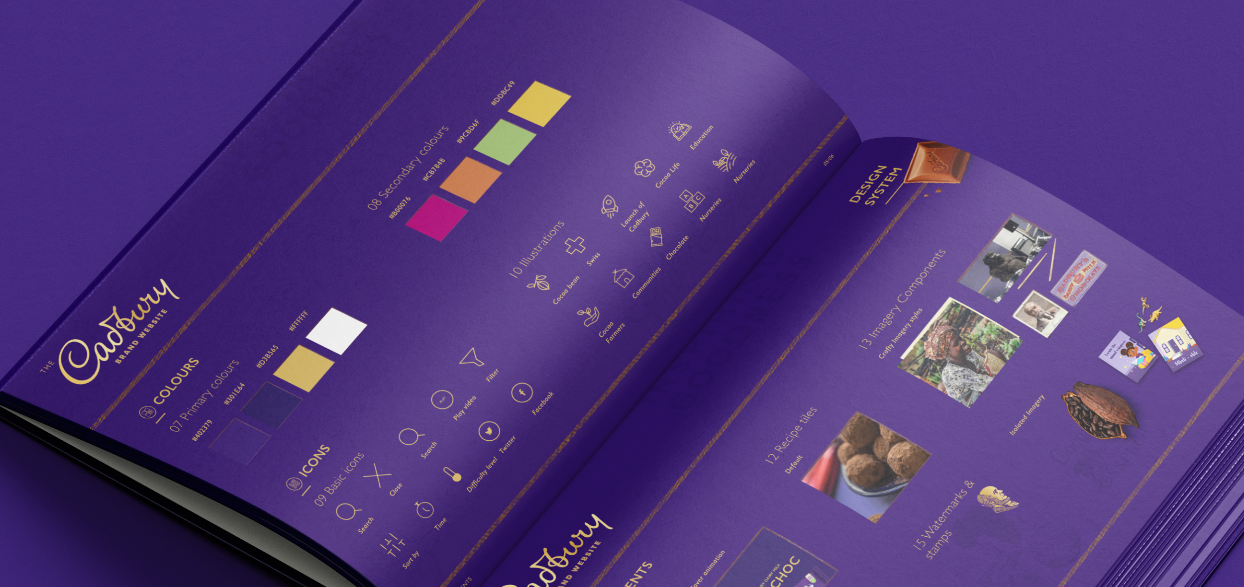
We began with a deep analysis of site analytics and existing content to shape a new information architecture. This guided the evolution of user journeys, ensuring they met both business objectives and user needs. Wireframes were created to define the structure, after which we applied the global rebrand across the interface. Our focus was on delivering a clean, modern UI infused with subtle interactions, moments of delight, and intuitive navigation—without unnecessary interstitials when moving between sections.
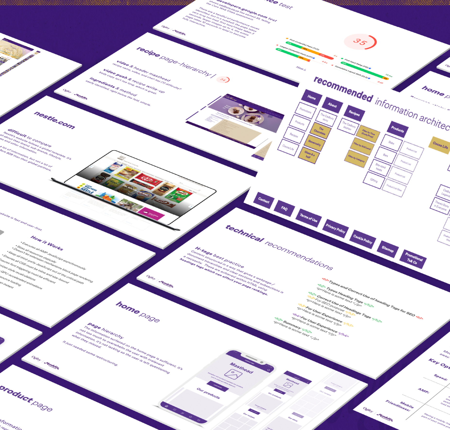
Solution
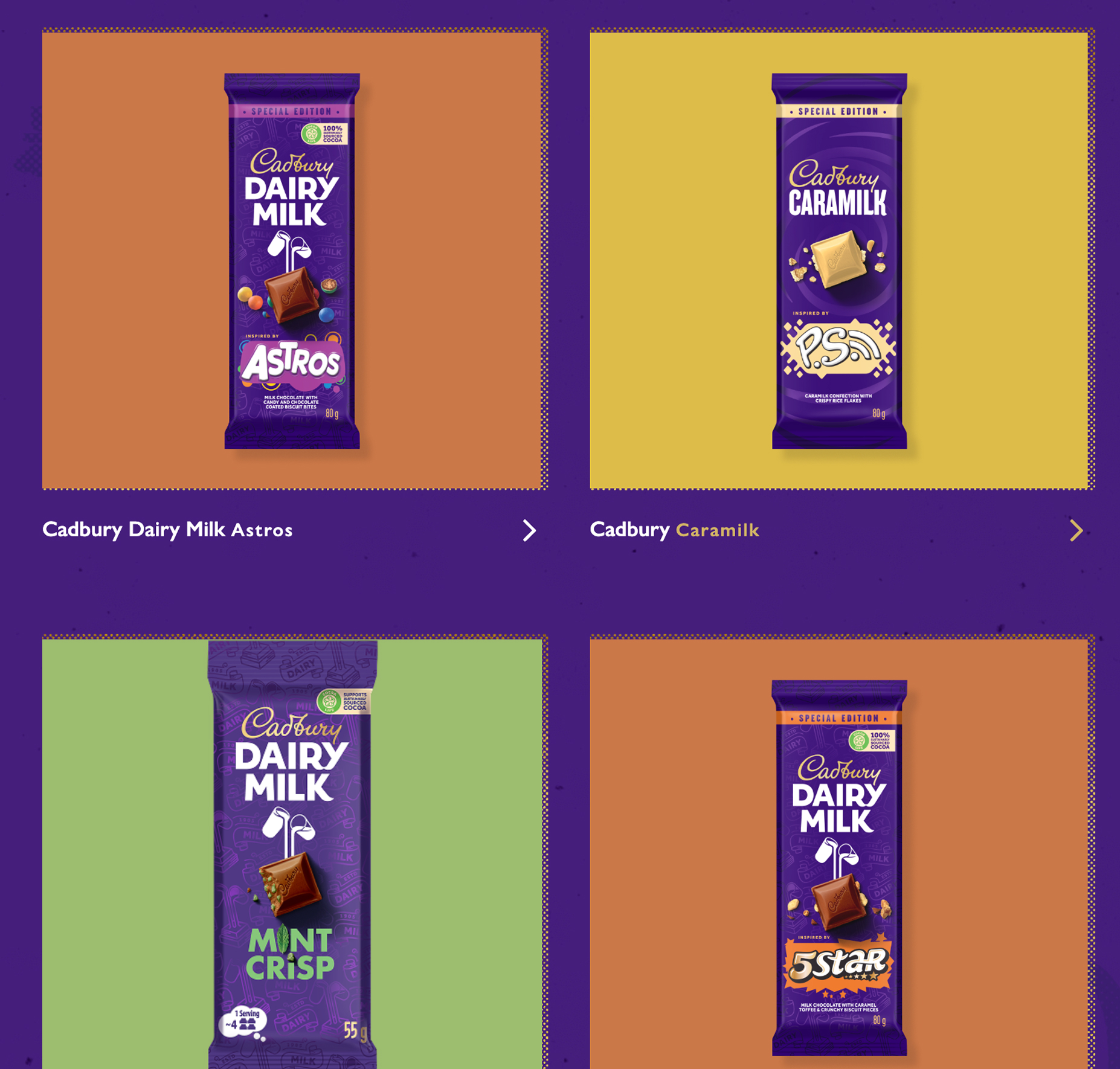
We started with a thorough analysis of the analytics and existing content to dictate the new information architecture. This was used to guide and evolve new user-journeys that would meet both business and user goals. Once our wire frames were defined, we were able to take cues from the global re-brand and work through a beautiful new UI, complete with simple surprise, delight and useful interaction design, and built with a custom Drupal CMS.The reconfiguration of the menu and product selection tabs has created an on-page experience that keeps the user engaged, without the need for interstitial’s when toggling between pages. We can see this when looking at the overall incremental increases in session/page views.The results speak for themselves: a 225% increase in session count (from 39,121 to 127,272) and a 462% increase in page views—achieved with no media support.
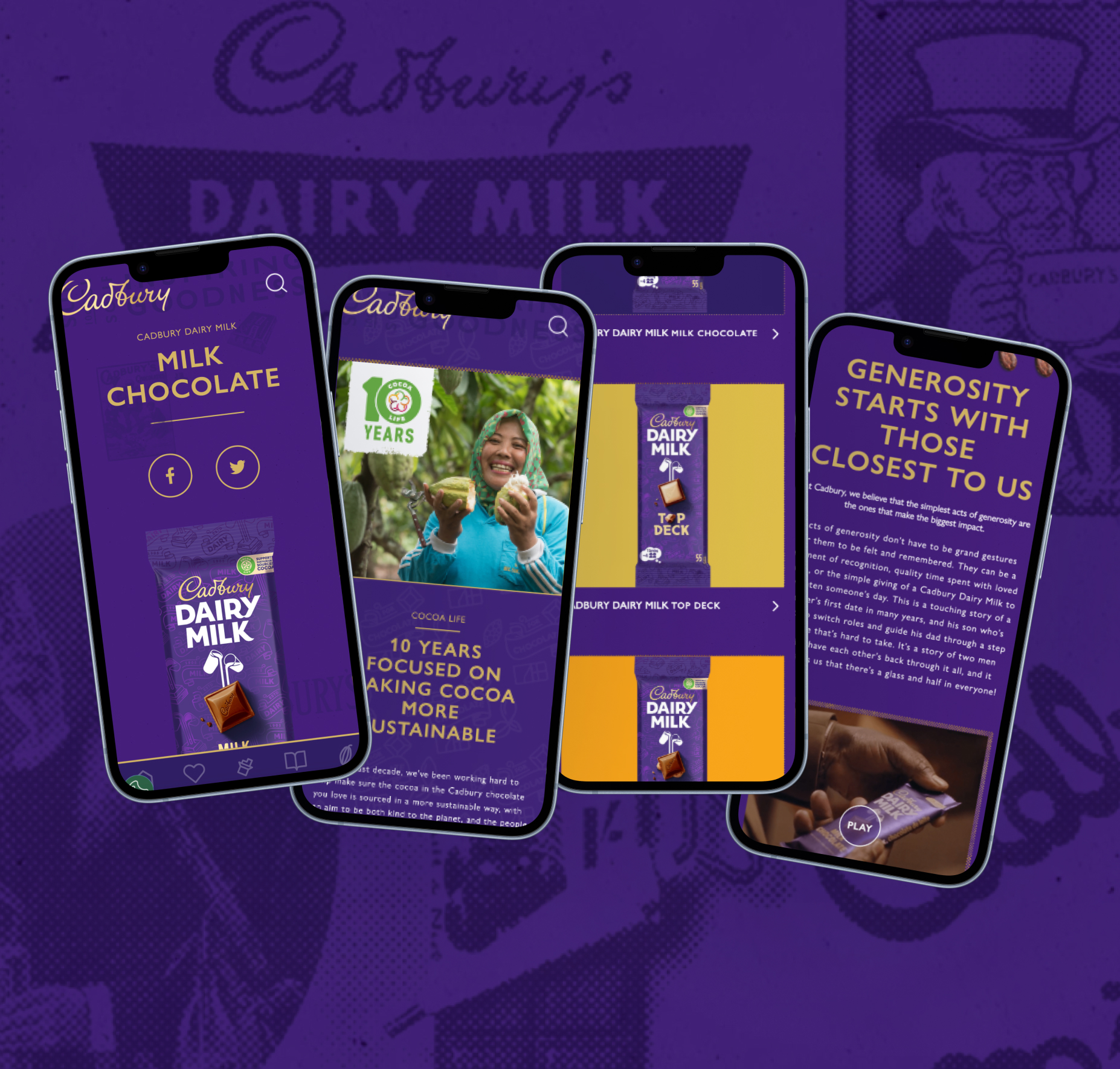
Interactions
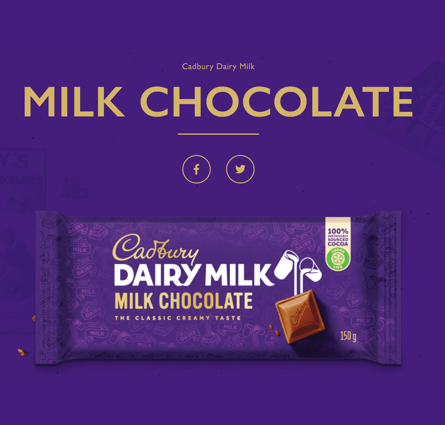
We designed playful hover states to add moments of delight—parallax effects animate text and background images as users scroll, and products give a subtle shake when hovered over, adding a touch of fun to the browsing experience.
Visit Website
→
Parallax- View on site
Product parallax - View on site
Fun milky button - View on site

Other Projects

Let’s create something great together. Get in touch.

CONTACT
jademegan@gmail.com
Cape Town, South Africa
NAV
Work
About
SOCIAL
Behance

Cadbury SA
The Brief
The Cadbury website was in dire need of an update. The same old website had been used for years and it had gradually become outdated from an aesthetic and technology POV as it had scaled over time. We were asked to completely overhaul the Experience Design of the website.
Take a look at the Behance case study here
* This project was completed under my contract with Ogilvy, for their client Cadbury.
Website
UI/UX
Visit Website
→
Design Process
We began with a deep analysis of site analytics and existing content to shape a new information architecture. This guided the evolution of user journeys, ensuring they met both business objectives and user needs. Wireframes were created to define the structure, after which we applied the global rebrand across the interface. Our focus was on delivering a clean, modern UI infused with subtle interactions, moments of delight, and intuitive navigation—without unnecessary interstitials when moving between sections.
Solution
We started with a thorough analysis of the analytics and existing content to dictate the new information architecture. This was used to guide and evolve new user-journeys that would meet both business and user goals. Once our wire frames were defined, we were able to take cues from the global re-brand and work through a beautiful new UI, complete with simple surprise, delight and useful interaction design, and built with a custom Drupal CMS.The reconfiguration of the menu and product selection tabs has created an on-page experience that keeps the user engaged, without the need for interstitial’s when toggling between pages. We can see this when looking at the overall incremental increases in session/page views.The results speak for themselves: a 225% increase in session count (from 39,121 to 127,272) and a 462% increase in page views—achieved with no media support.
Interactions
We designed playful hover states to add moments of delight—parallax effects animate text and background images as users scroll, and products give a subtle shake when hovered over, adding a touch of fun to the browsing experience.
Visit Website
→
Parallax- View on site
Fun product shake - View on site
Product parallax - View on site
Fun milky button - View on site

Other Projects

Let’s create something great together. Get in touch.


CONTACT
jademegan@gmail.com
Cape Town, South Africa
NAV
Work
About
SOCIAL
Behance