Case Study
Design 4 Retail
Design 4 Retail is a UK-based agency specializing in Retail design for in-store environments. They approached us to redesign their website, which at the time felt cluttered, out dated and lacking in structure.
The main objective was to position the brand to attract a higher caliber of client, specifically luxury and premium brands, and secure larger-scale, global projects. The new website design needed to reflect premium quality while remaining timeless, structured, and user-friendly.
* This project was completed under my contract with Herdl, for their client Design 4 Retail.
Website
Development
Visit Website
→
Design Process
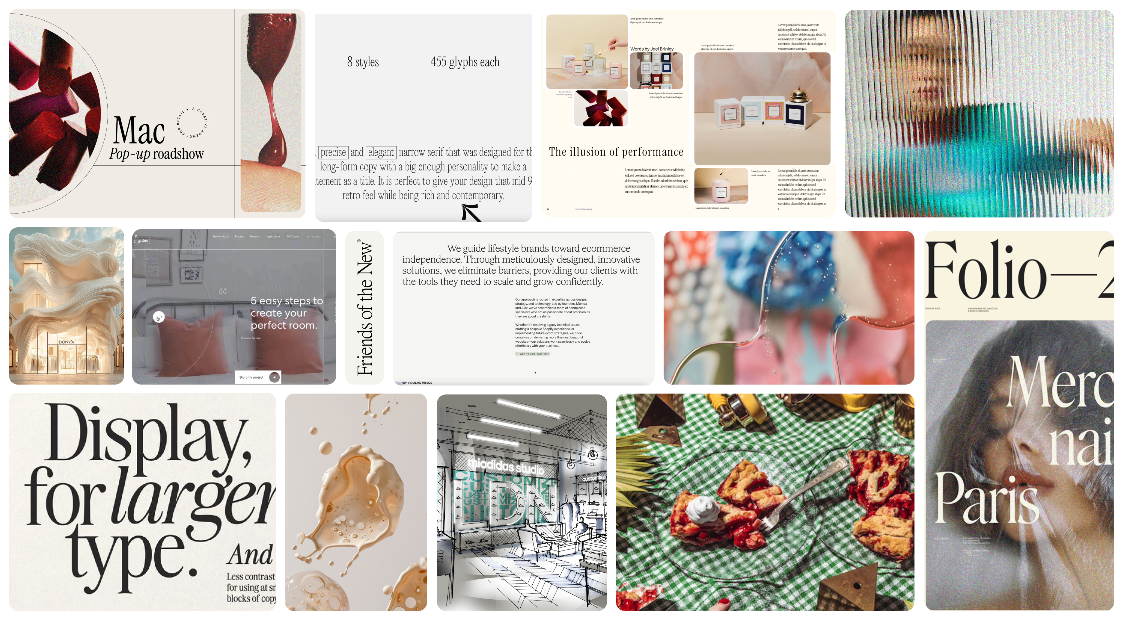
We began by analyzing their detailed brief, which provided clear visual and functional direction. From there, we developed mood boards to explore interpretations of the desired modern editorial aesthetic. The chosen direction balanced structured elegance with dynamic, engaging elements, aligning with their position as industry thought leaders. The chosen direction considered all the aesthetic elements client asked for, showing them how this could be brought to life in the design.
Key design decisions included a consistent grid line system, a refined typography hierarchy blending minimalist sans-serifs with bold manifesto serif statements, and a restricted colour palette for premium clarity. We planned motion and interaction design to add character without distraction and created modular content blocks for maximum flexibility.
At every stage, we stayed aligned with the brand’s goals—premium appeal, clarity, and luxury positioning—to ensure the site would attract a higher-calibre audience.
Chosen moodboard direction
The Grid
One of our main goals was to bring structure and clarity to D4R’s digital presence, replacing a cluttered design with a modern, grid-based system. We developed several grid variations, reusing them across the site to create a consistent yet flexible design language.
This approach extended into the CMS, where we built a modular, block-based system with advanced custom fields. Each content block—carousels, split layouts, text, image/video—was designed for re-usability, giving D4R the freedom to build new pages quickly while maintaining brand consistency.
Solution
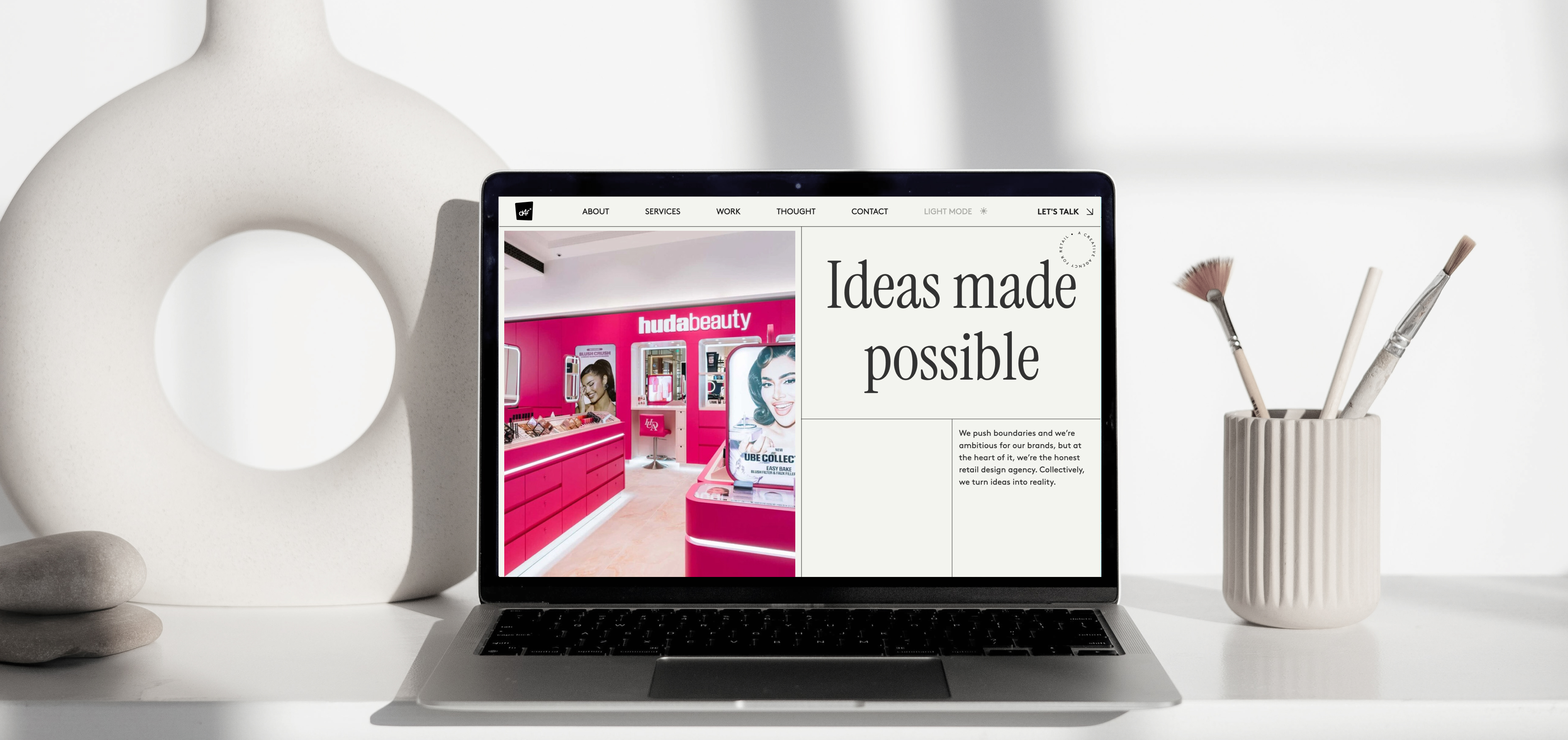
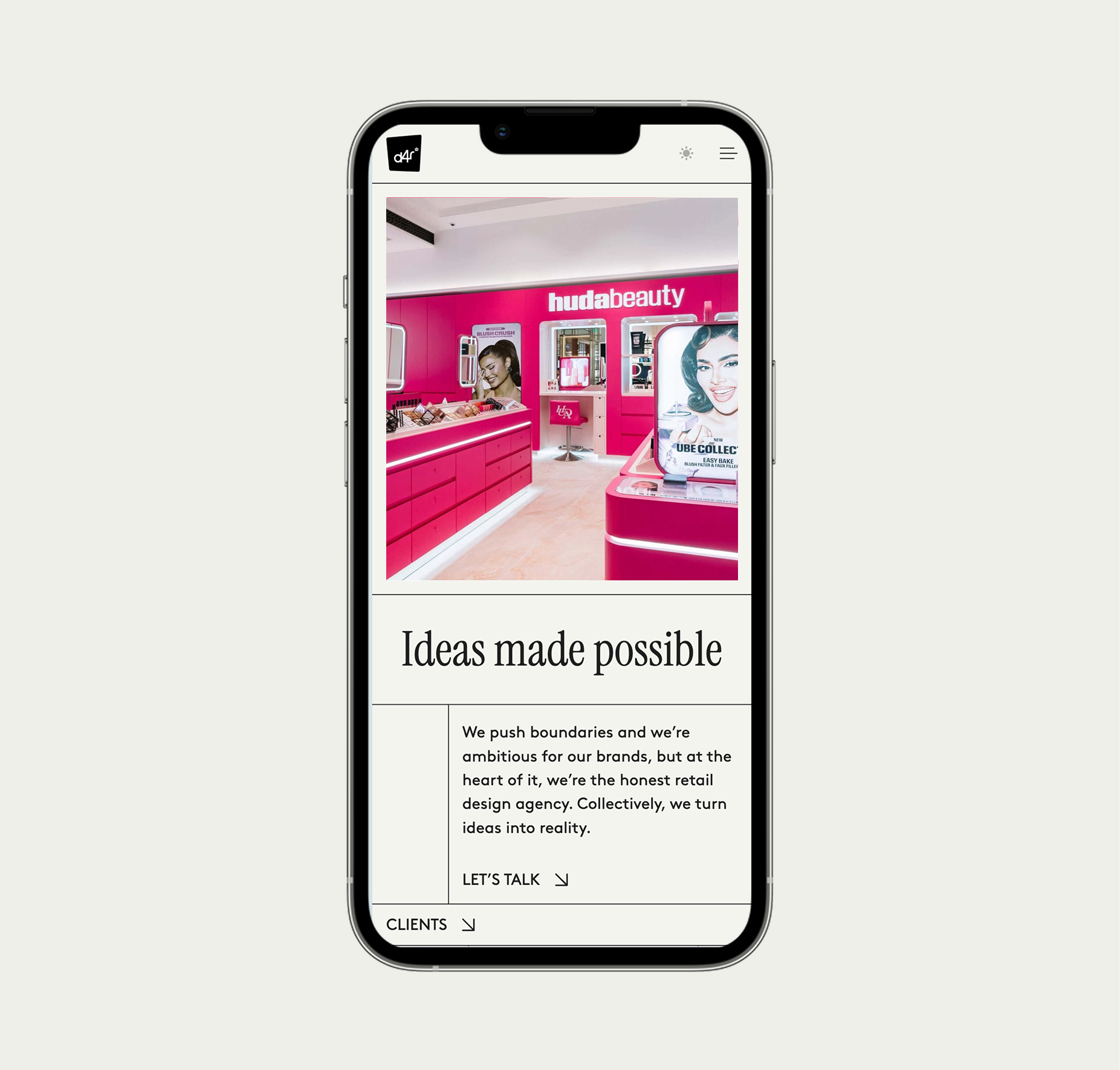
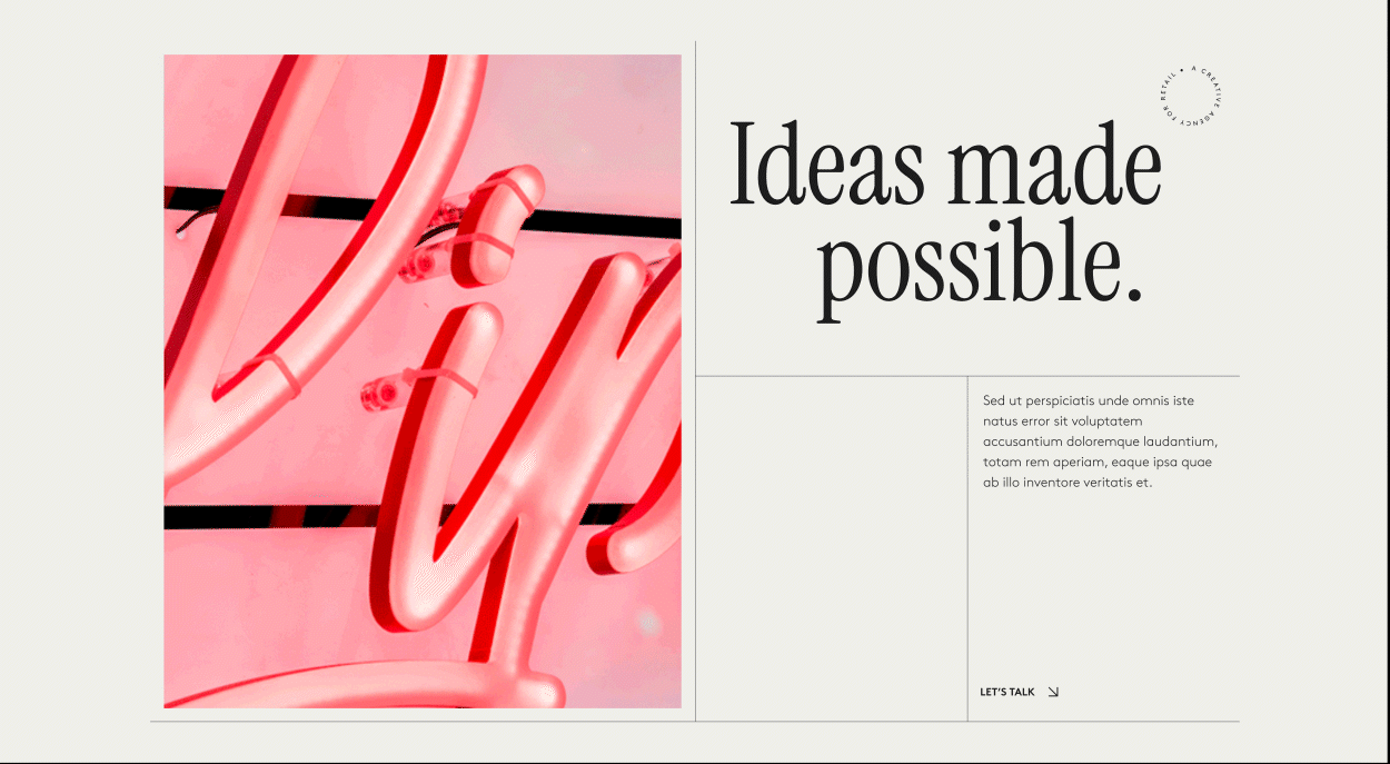
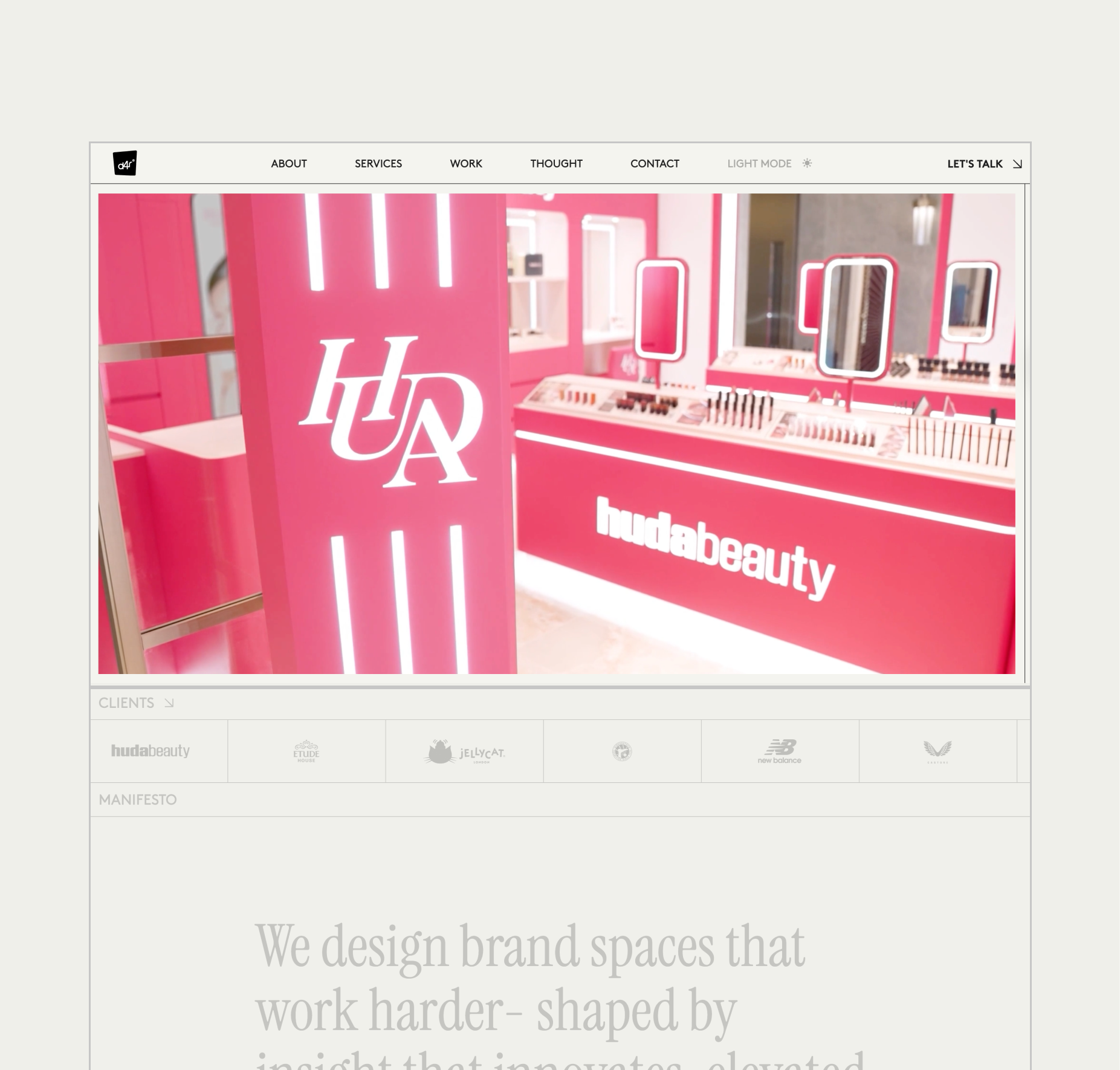
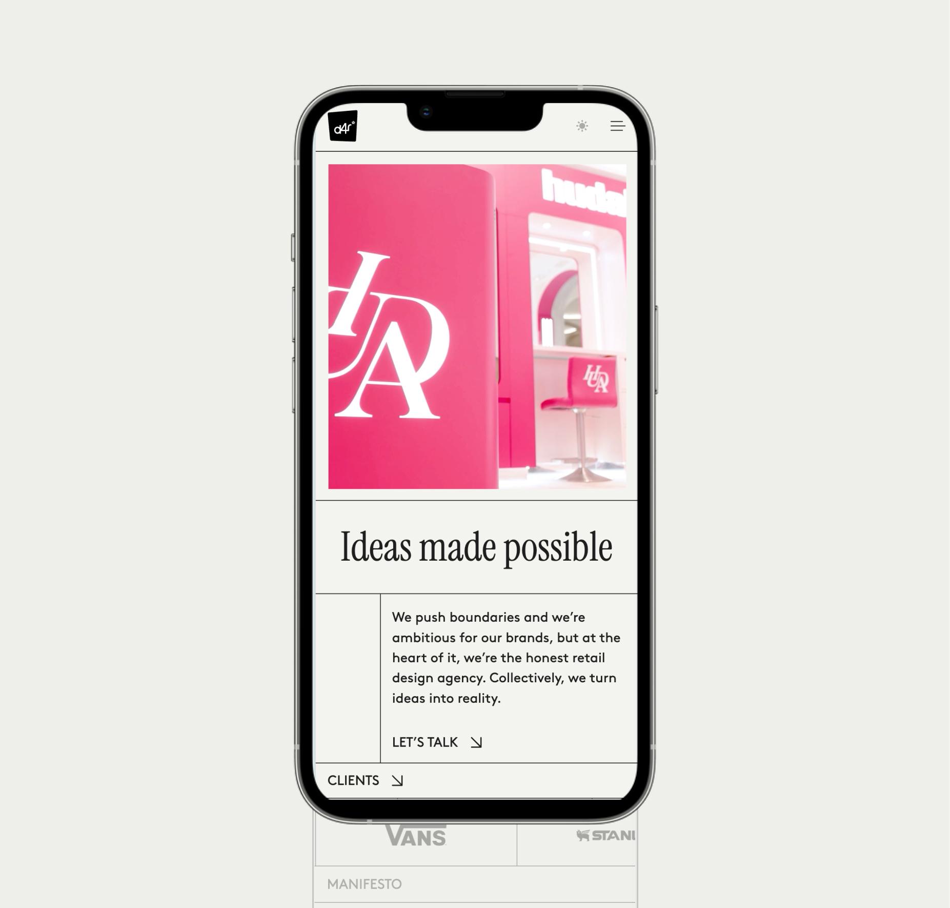
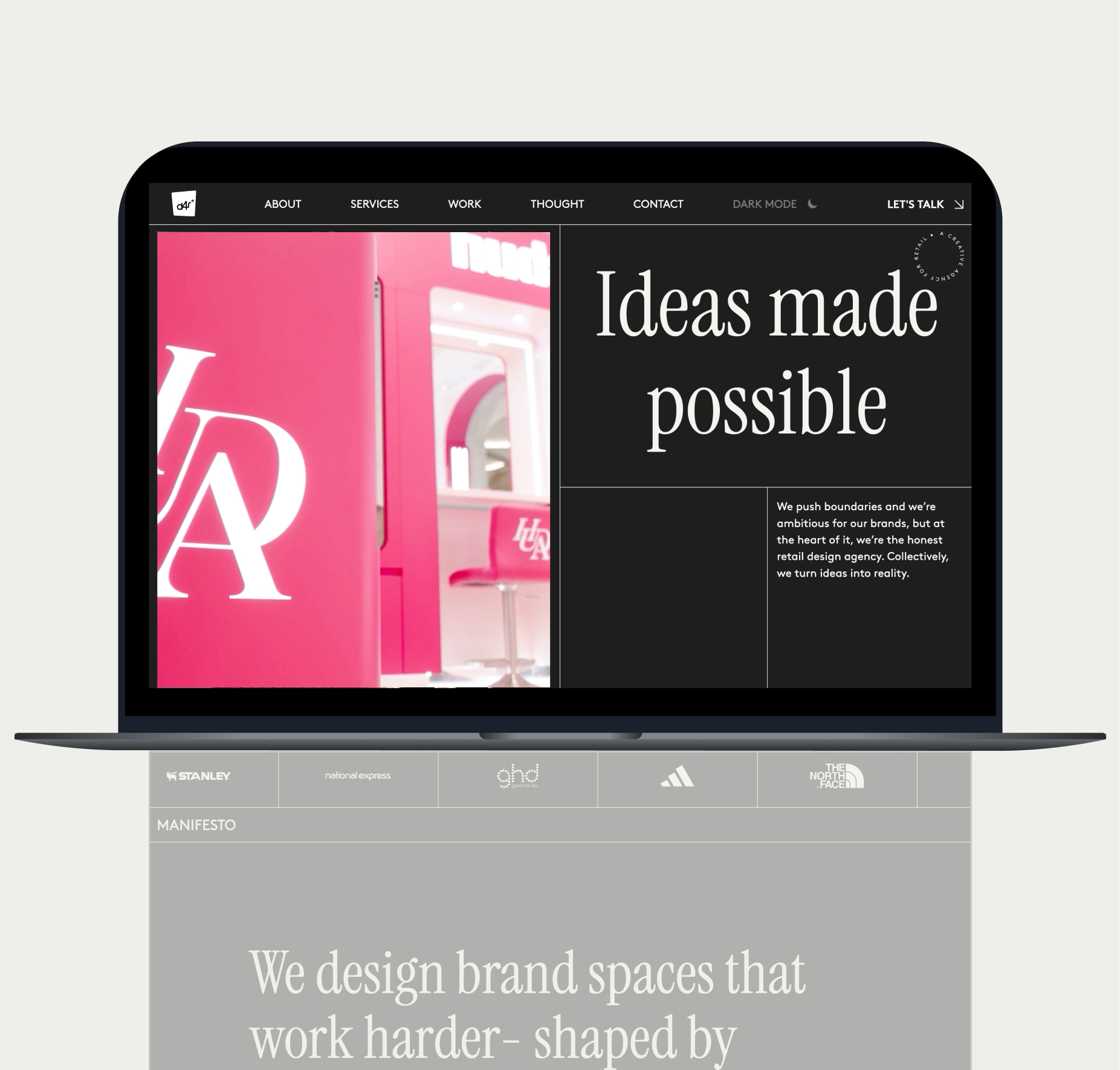
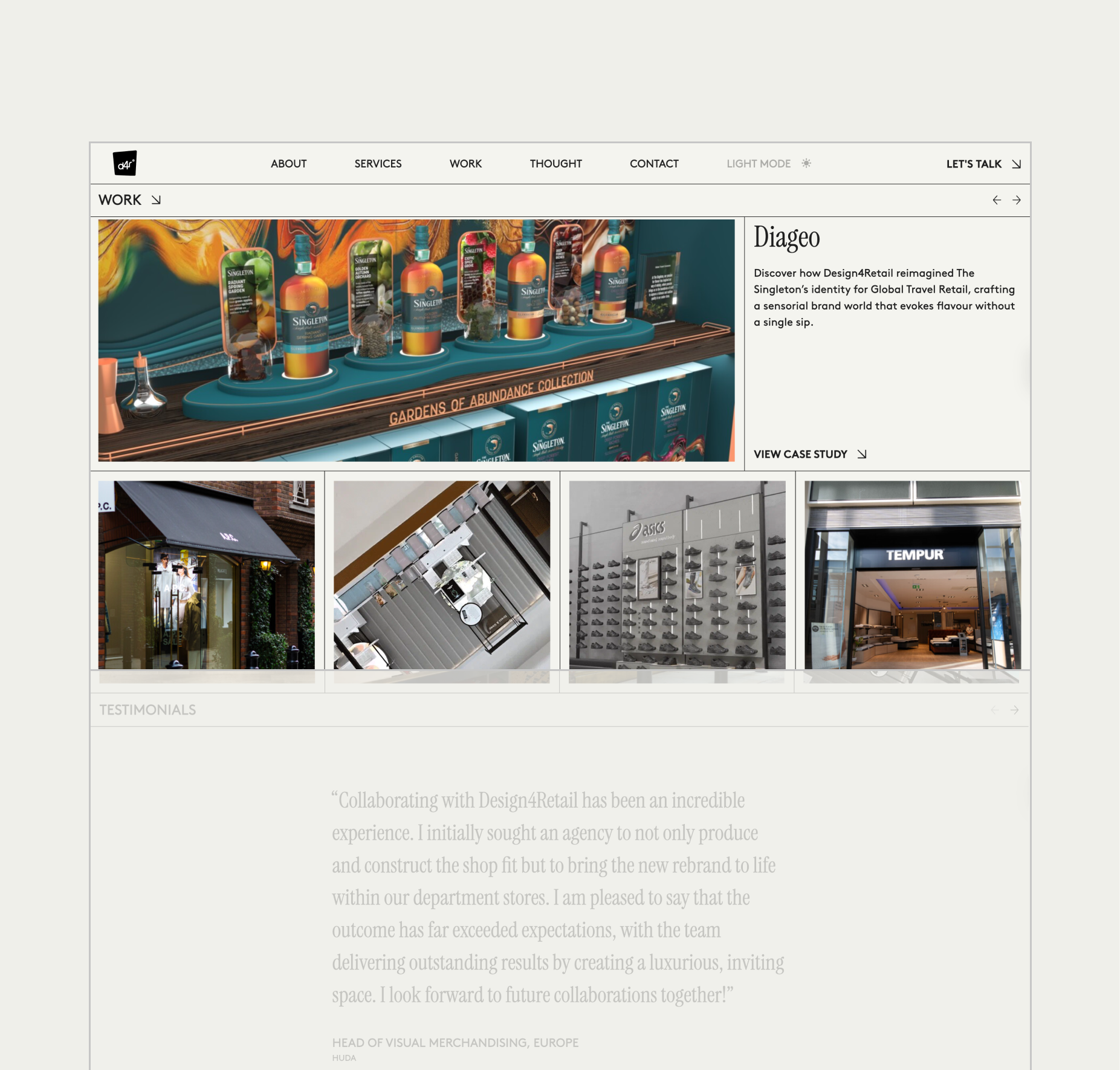
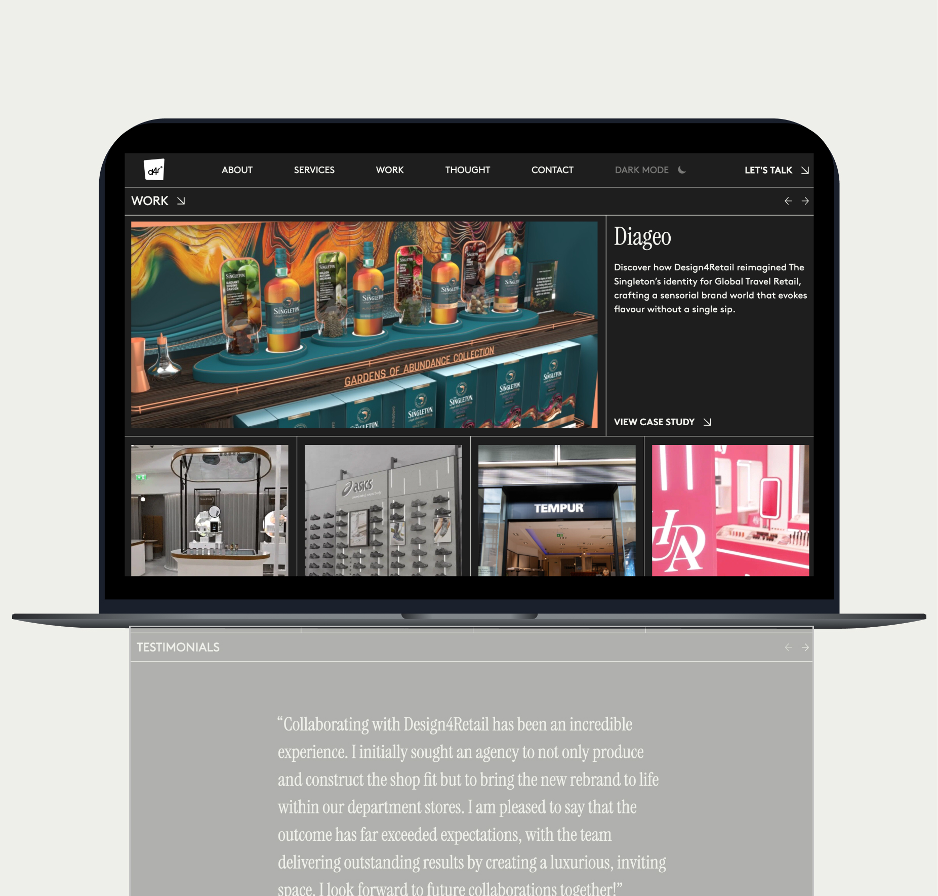
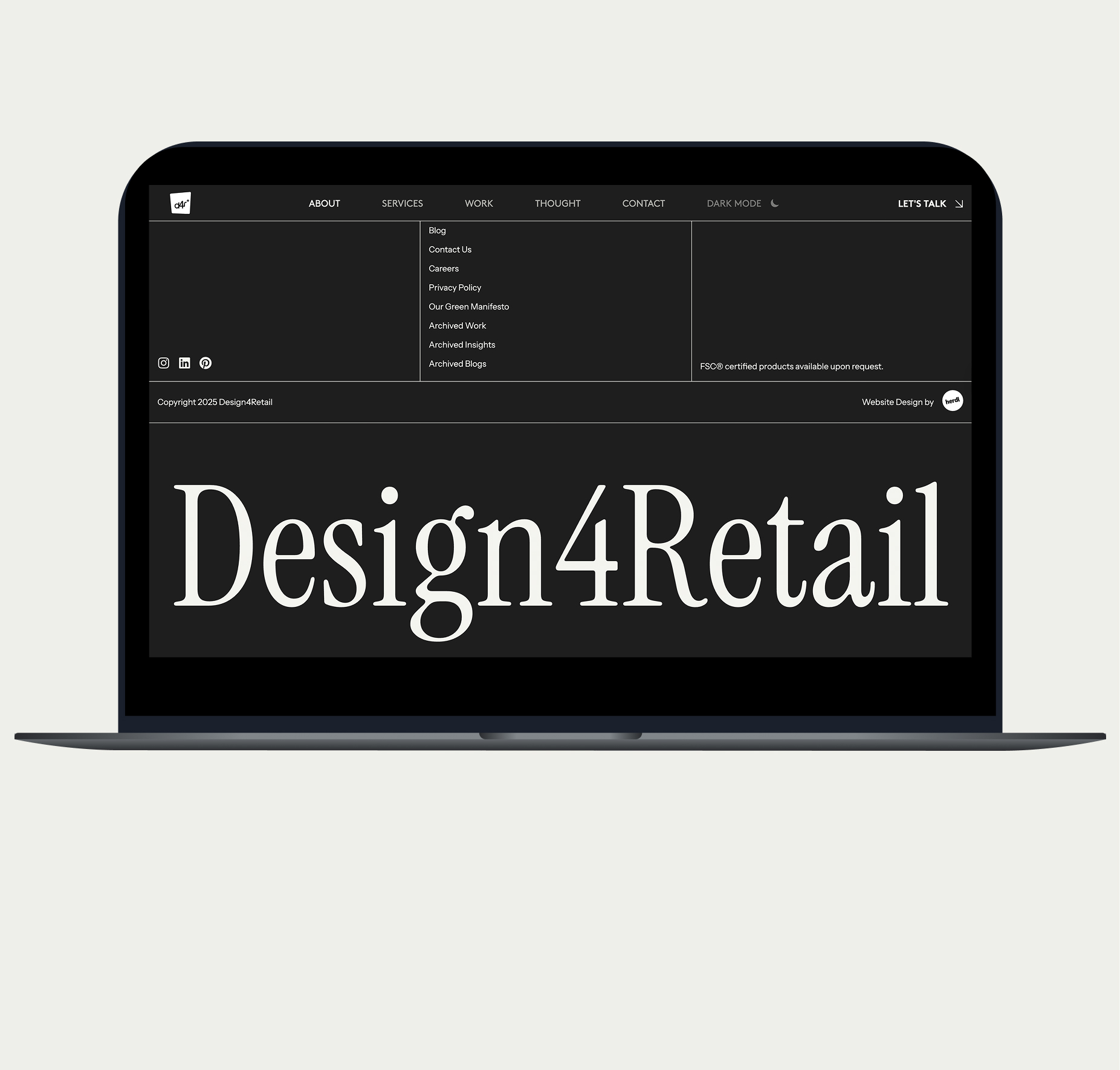
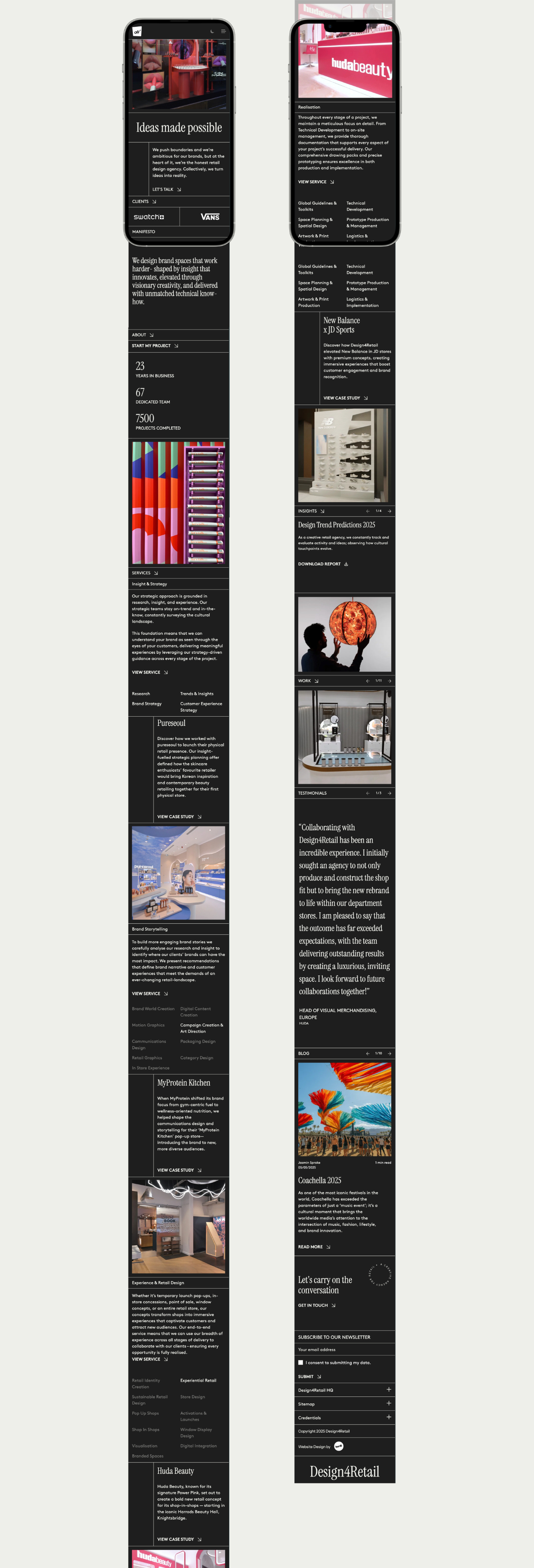
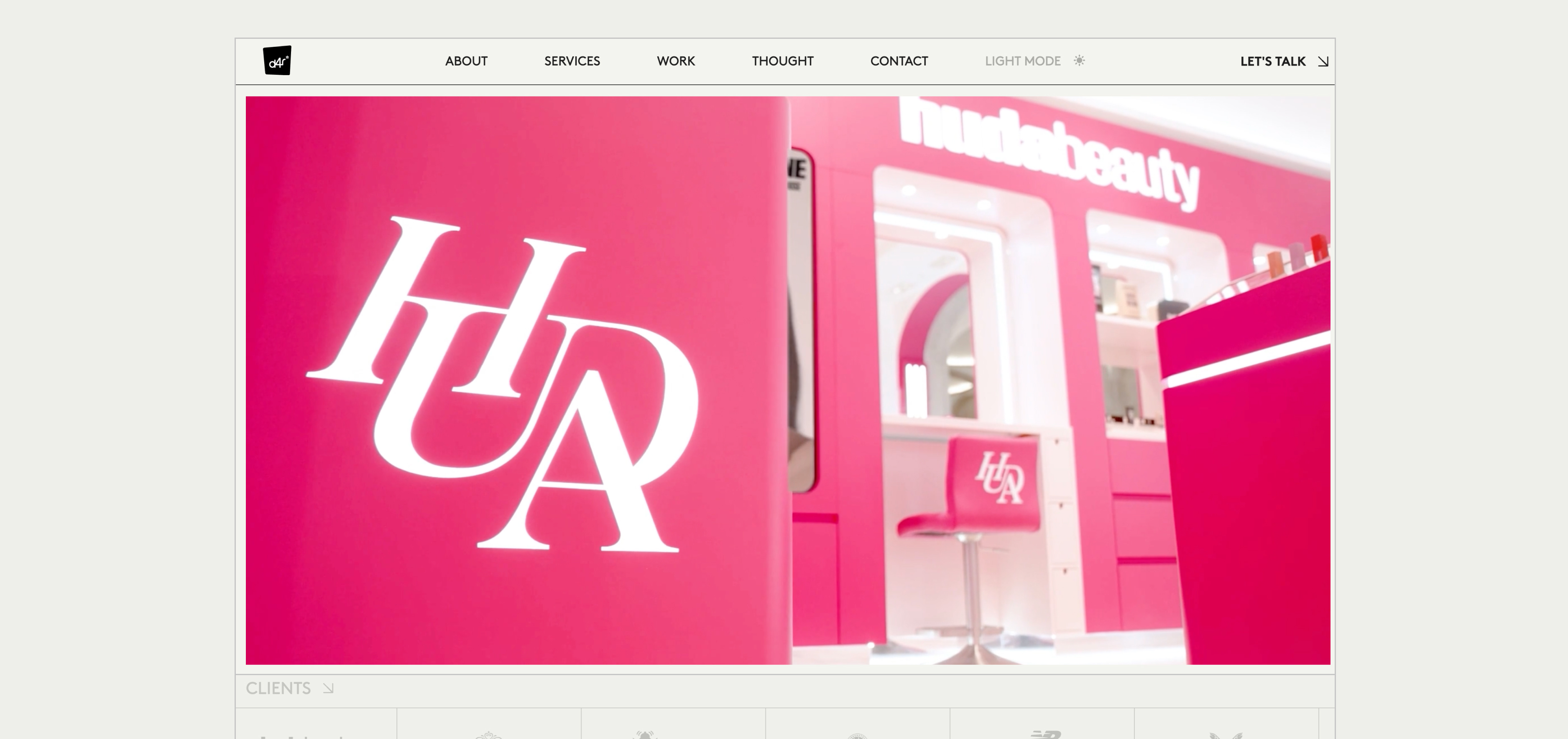
The final website is a refined balance between editorial sophistication and functional clarity. When landing on the home page, users are greeted by a full-screen show reel that instantly communicates the scale and creativity of Design 4 Retail’s work.
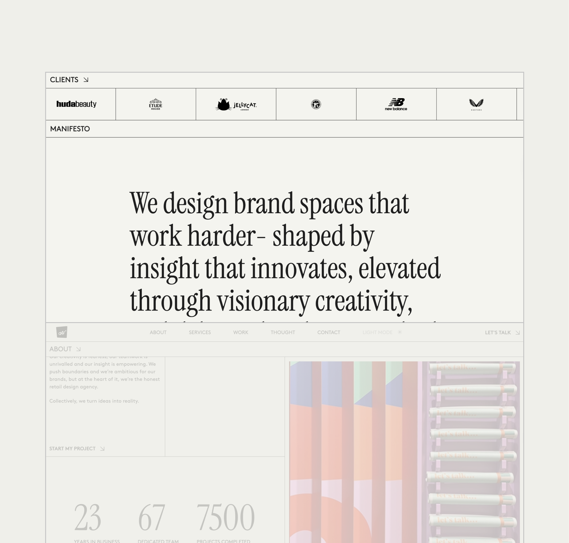
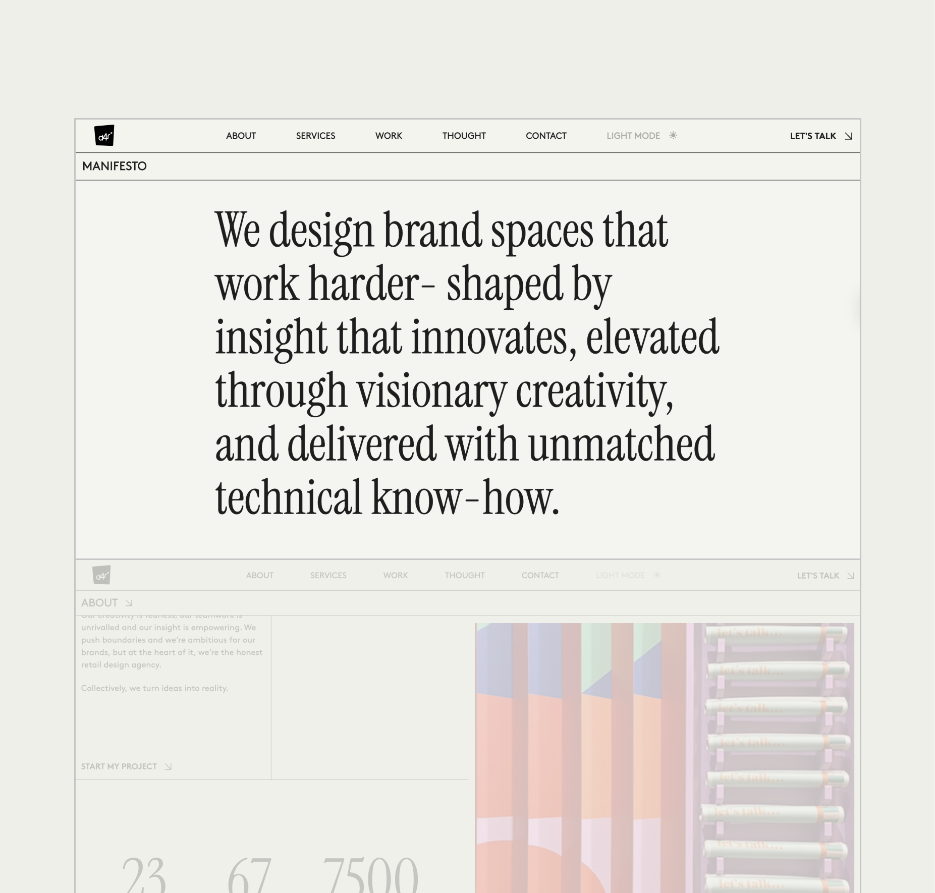
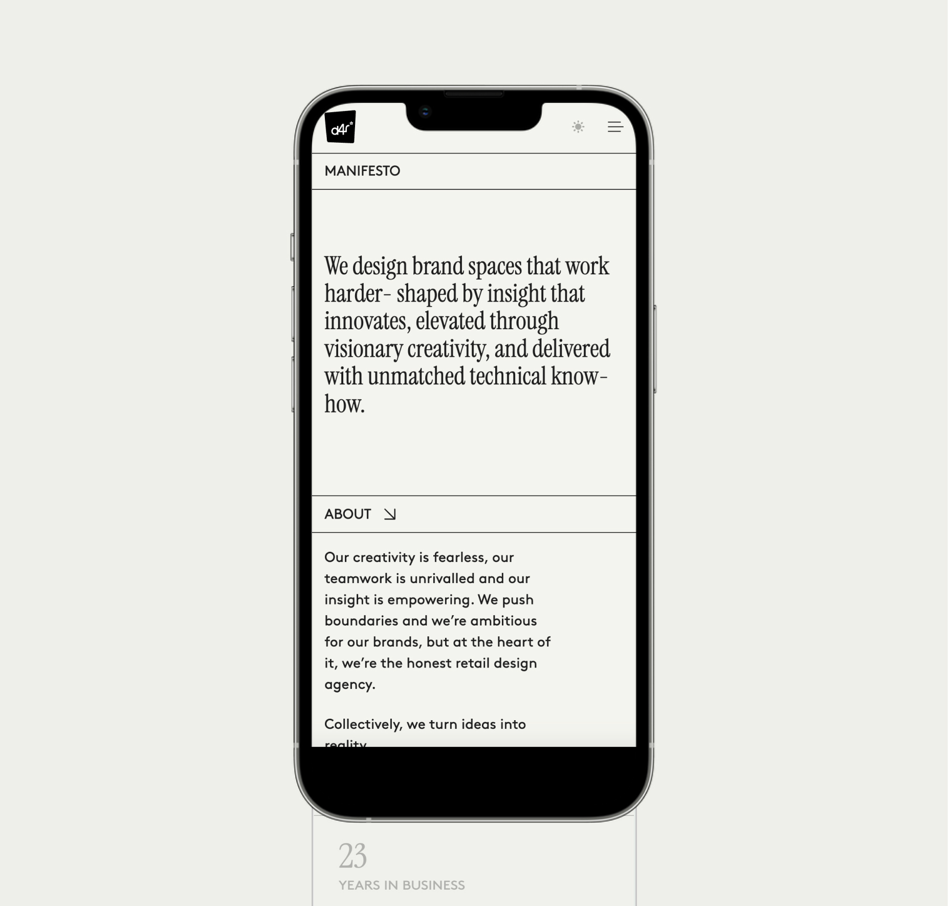
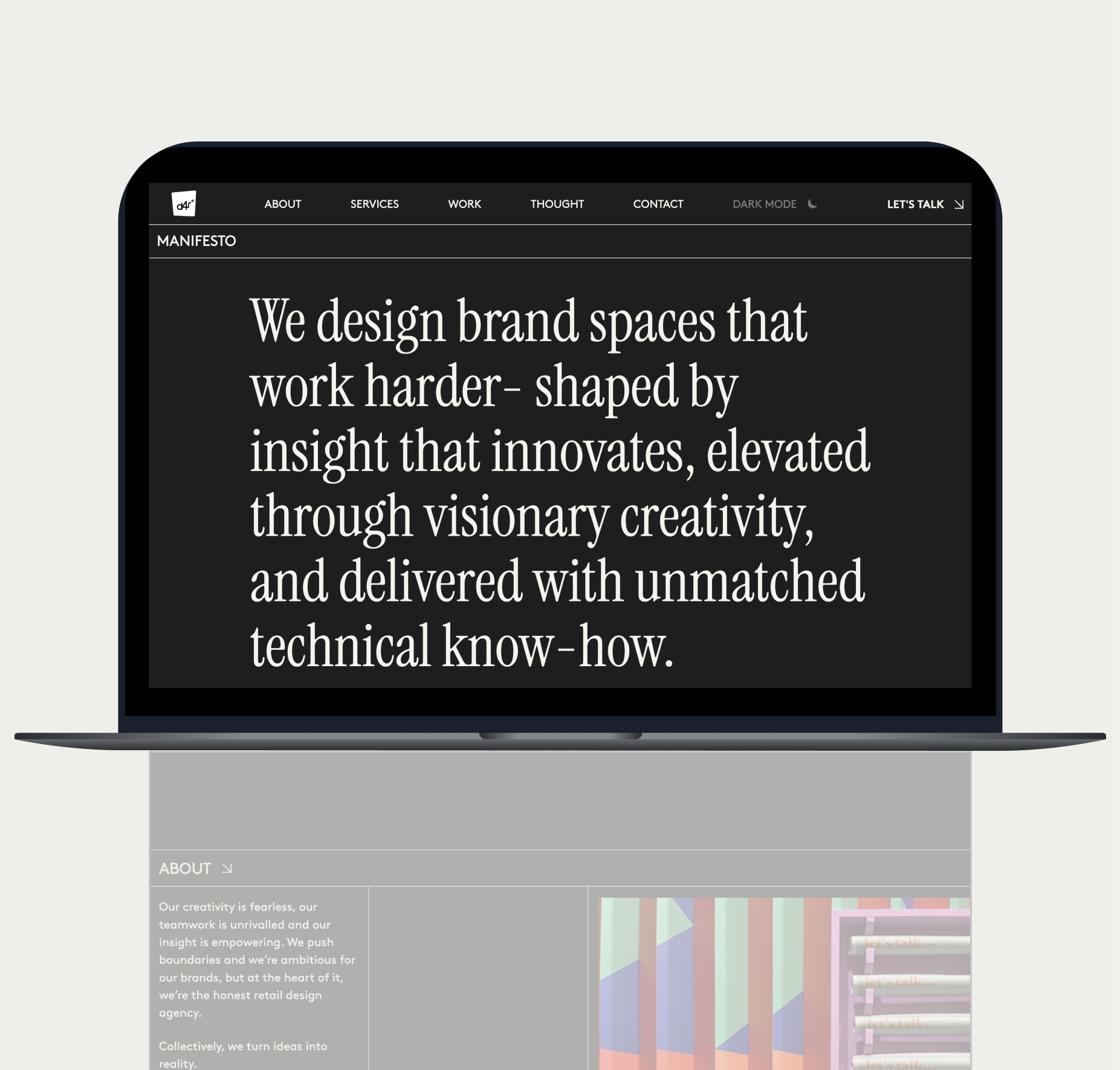
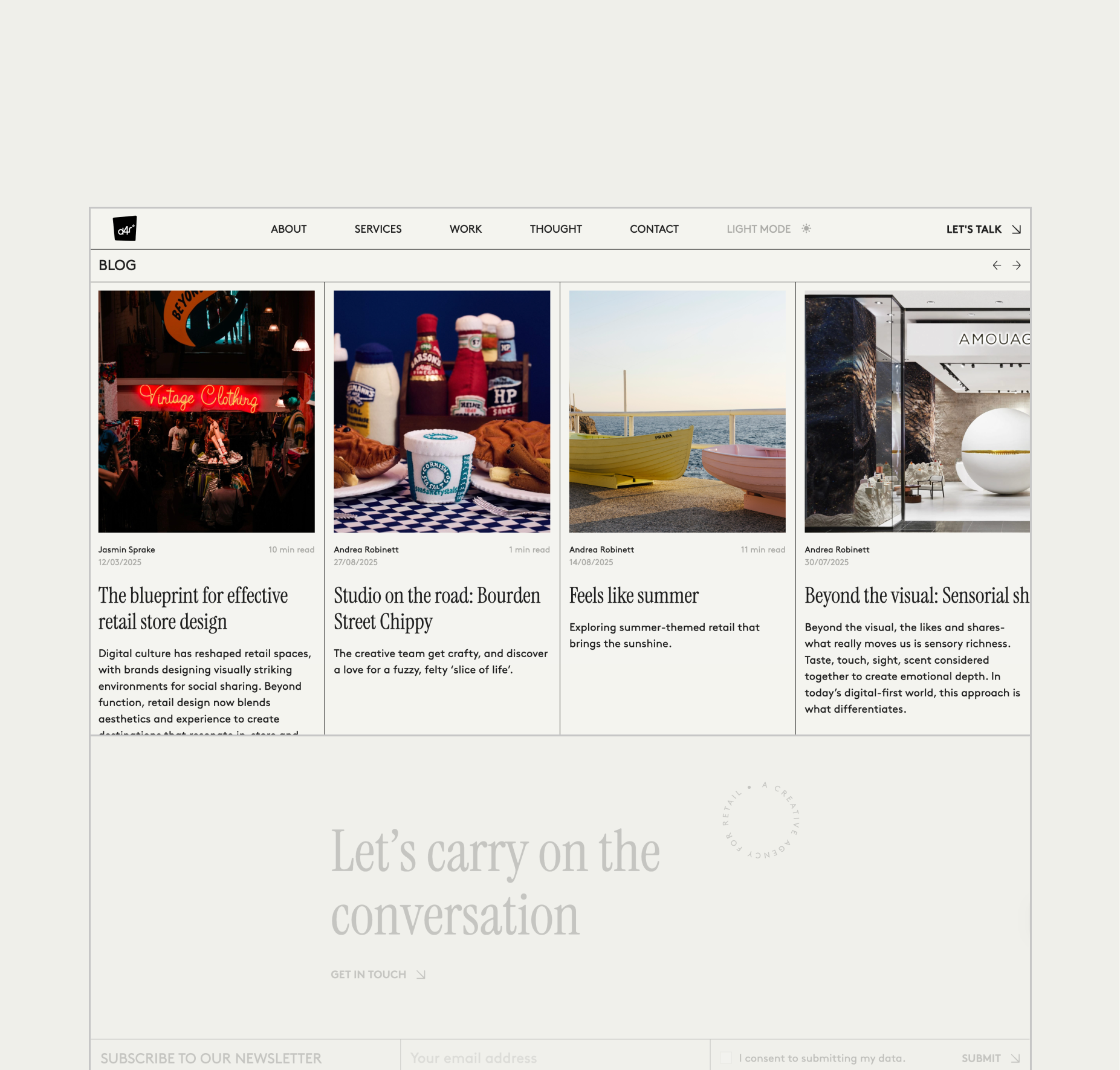
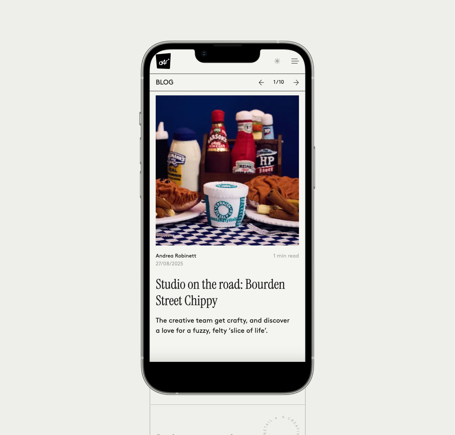
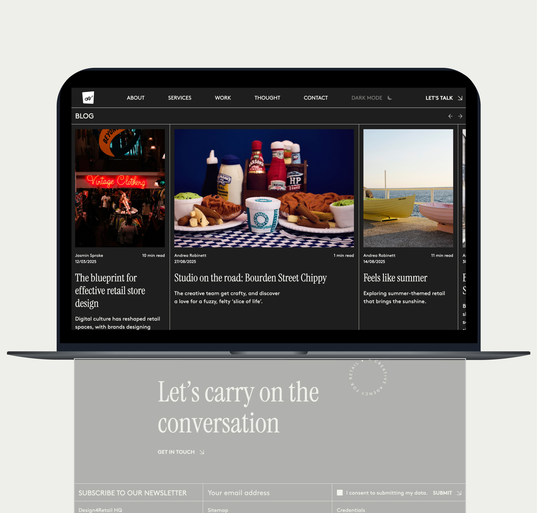
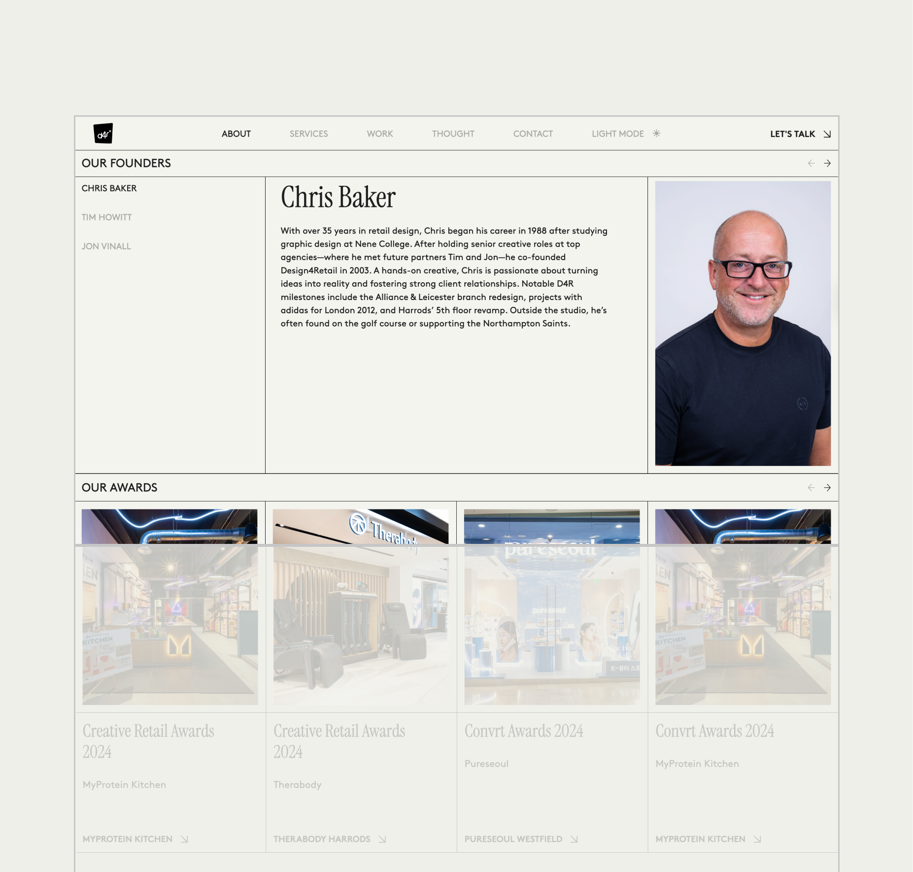
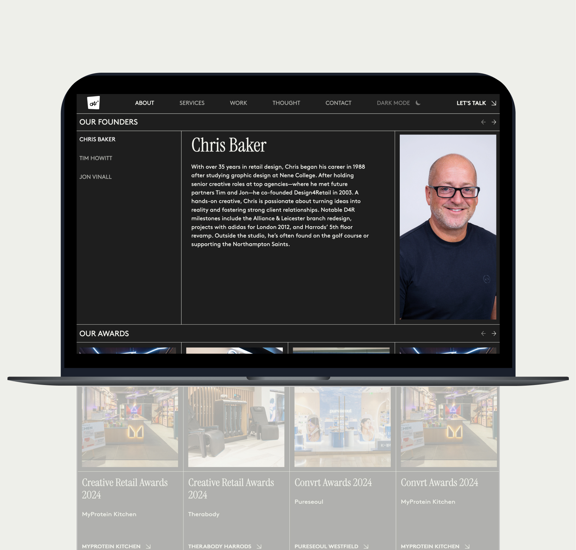
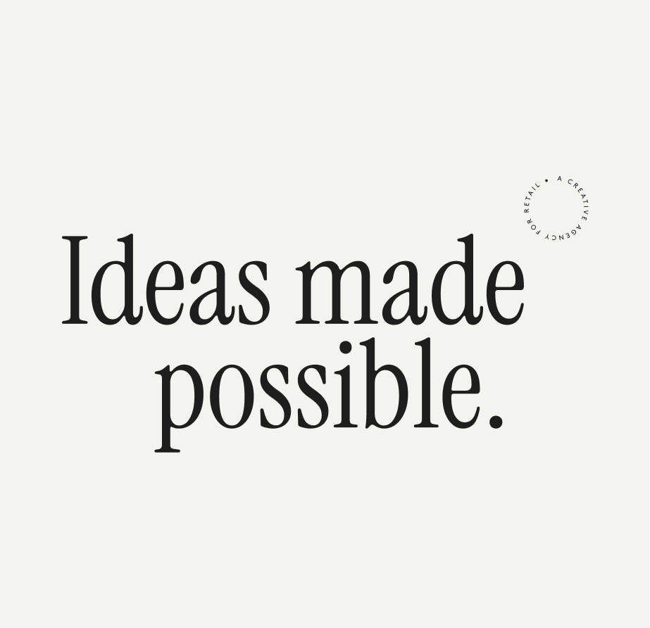
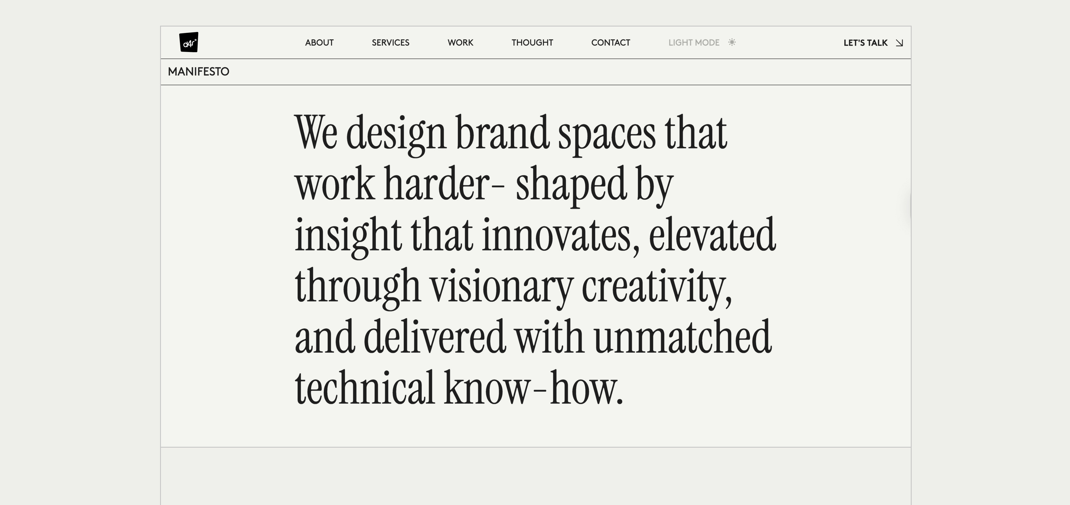
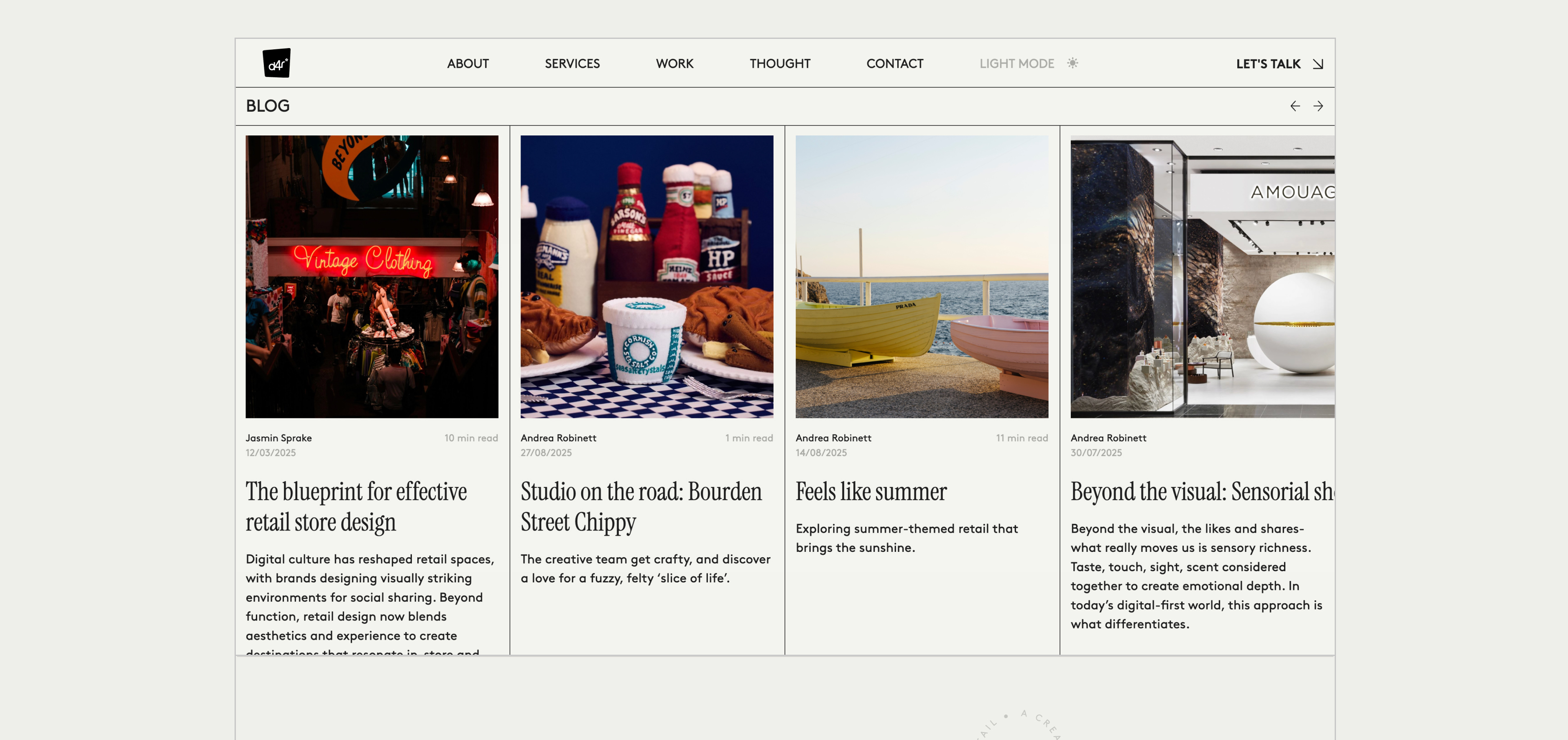
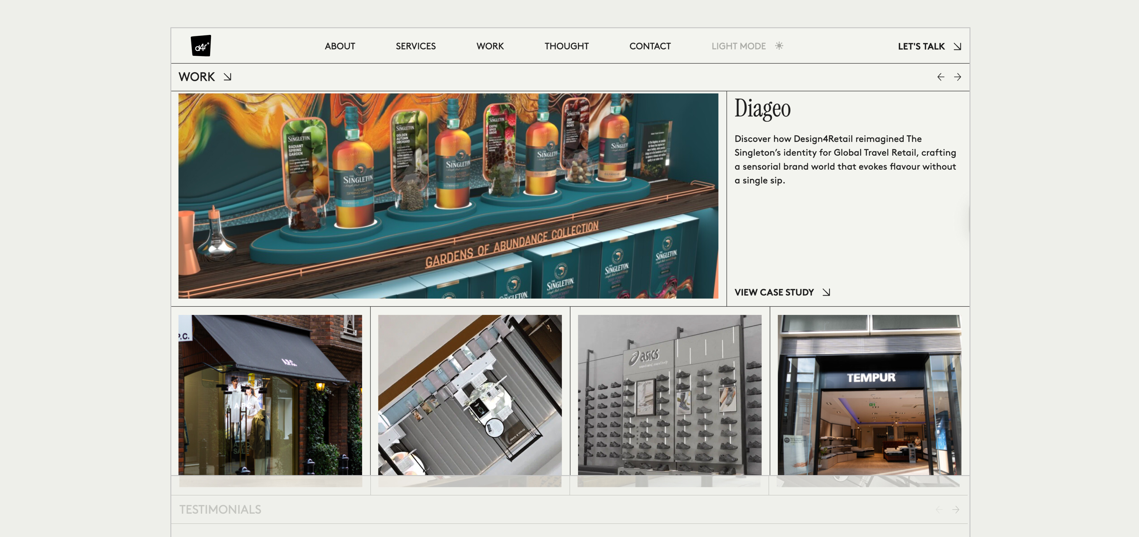
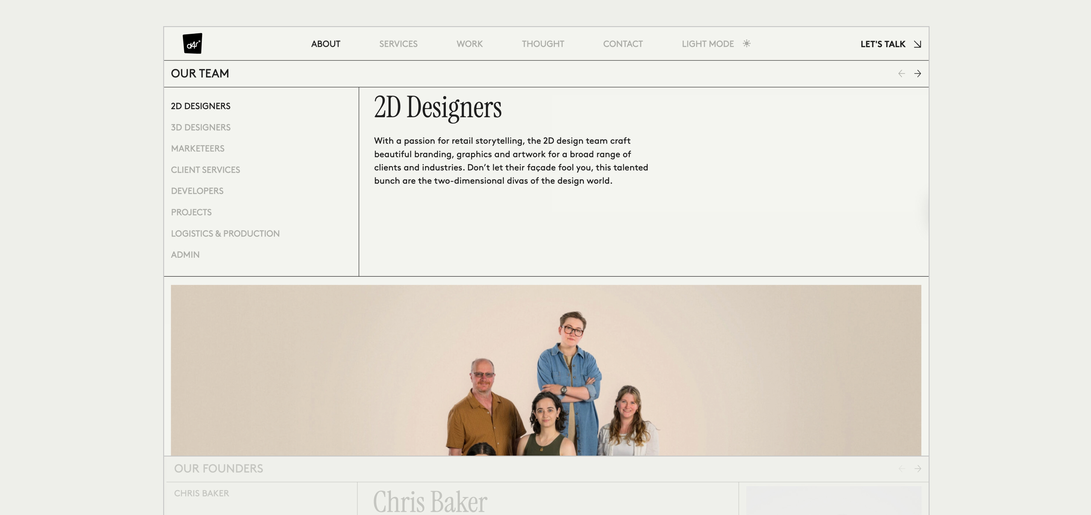
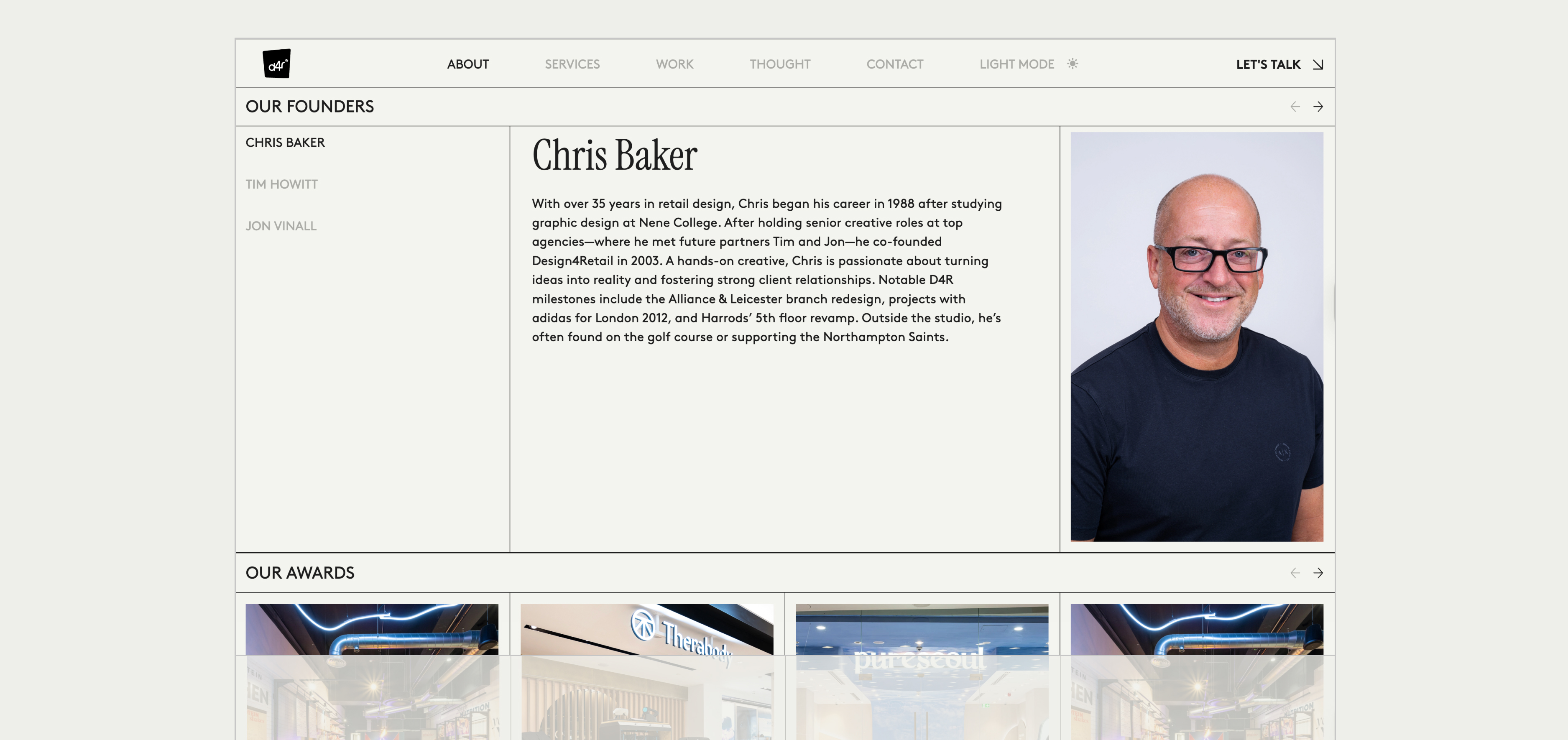
The off-white background and precisely structured black grid lines provide a timeless foundation, while the consistent grid line patterns unify the site’s diverse content layouts. Clean typography and selective use of bold manifesto statements reinforce their authority and vision. The restricted colour palette keeps the focus on imagery and content, while portrait and landscape photography are combined strategically for maximum visual impact.
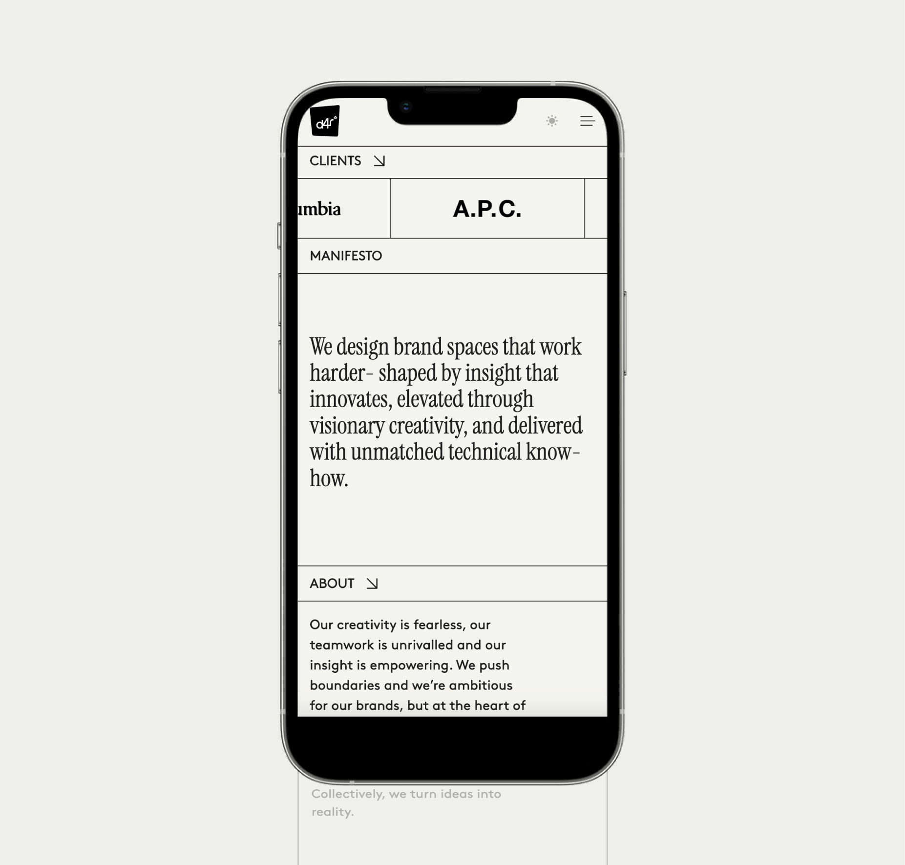
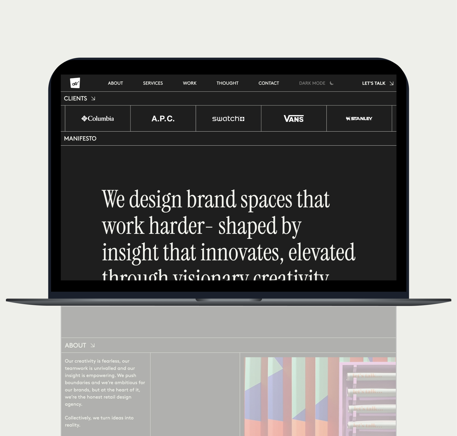
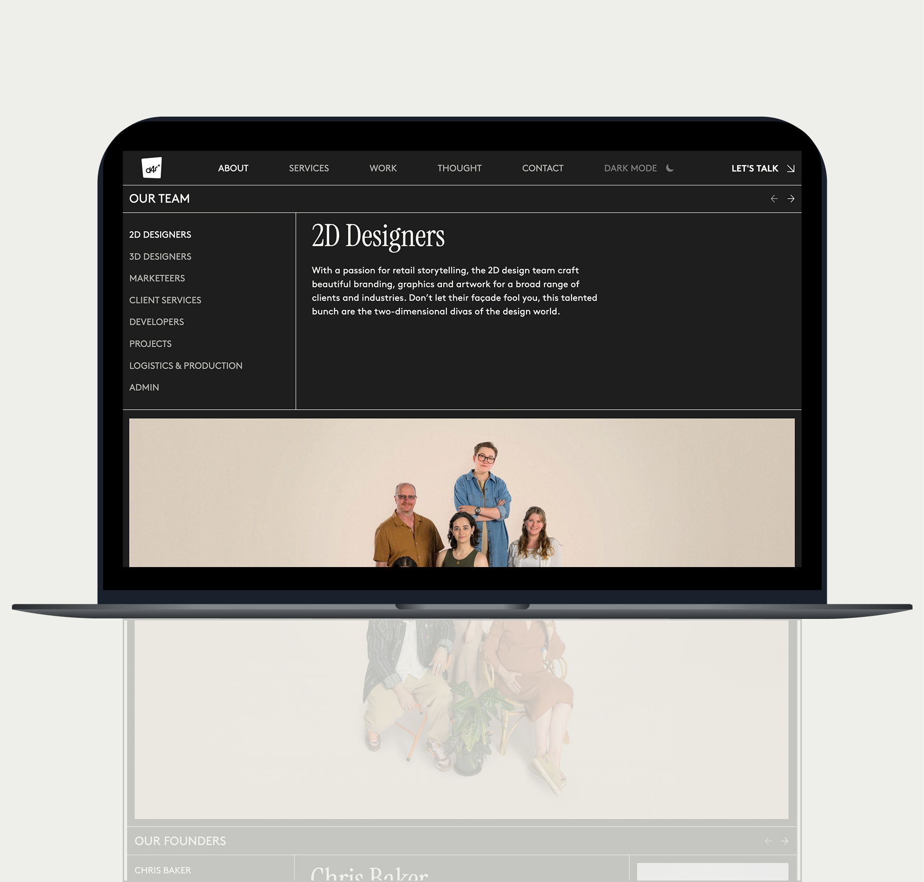
User experience is enhanced through micro-interactions and subtle animations as seen below, that add depth and engagement without compromising clarity. Light, Dark and system mode offer the user personalized comfort, adapting to different environments and times of day, and impacting user perception and device functionality.
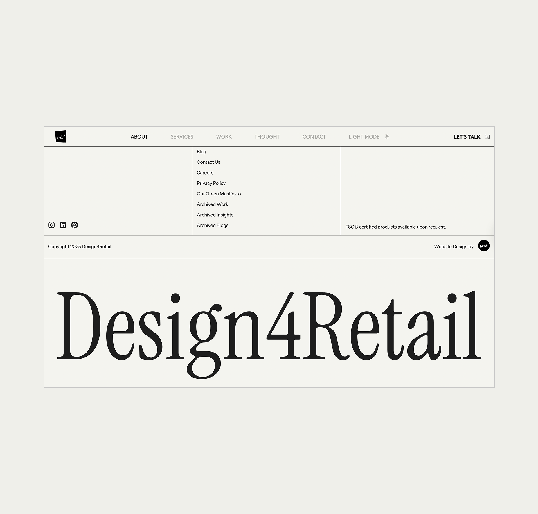
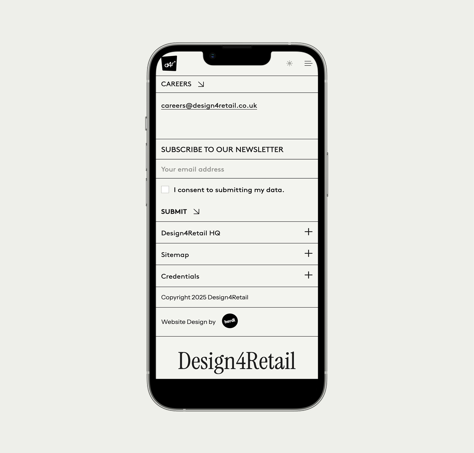
A static, traditional header bar ensures effortless navigation, while a clever bottom-of-page reward encourages exploration to the very end.
On the back end, the site is built using a flexible CMS with advanced custom fields, enabling a modular, block approach. Each content block—from carousels to split layouts—was designed for re-usability, giving Design 4 Retail the freedom to create new pages quickly while preserving the integrity of the brand’s visual system.
The result is a high-end, mobile responsive website that positions the brand as a leader in their sector—visually aligned with luxury brand expectations, functionally built for flexibility, and strategically crafted to attract larger-scale, global projects.
Visit Website
→
Client Ticker - View on site
Manifesto - View on site
Editorial Blog Carousel - View on site
Case Study Carousel - View on site
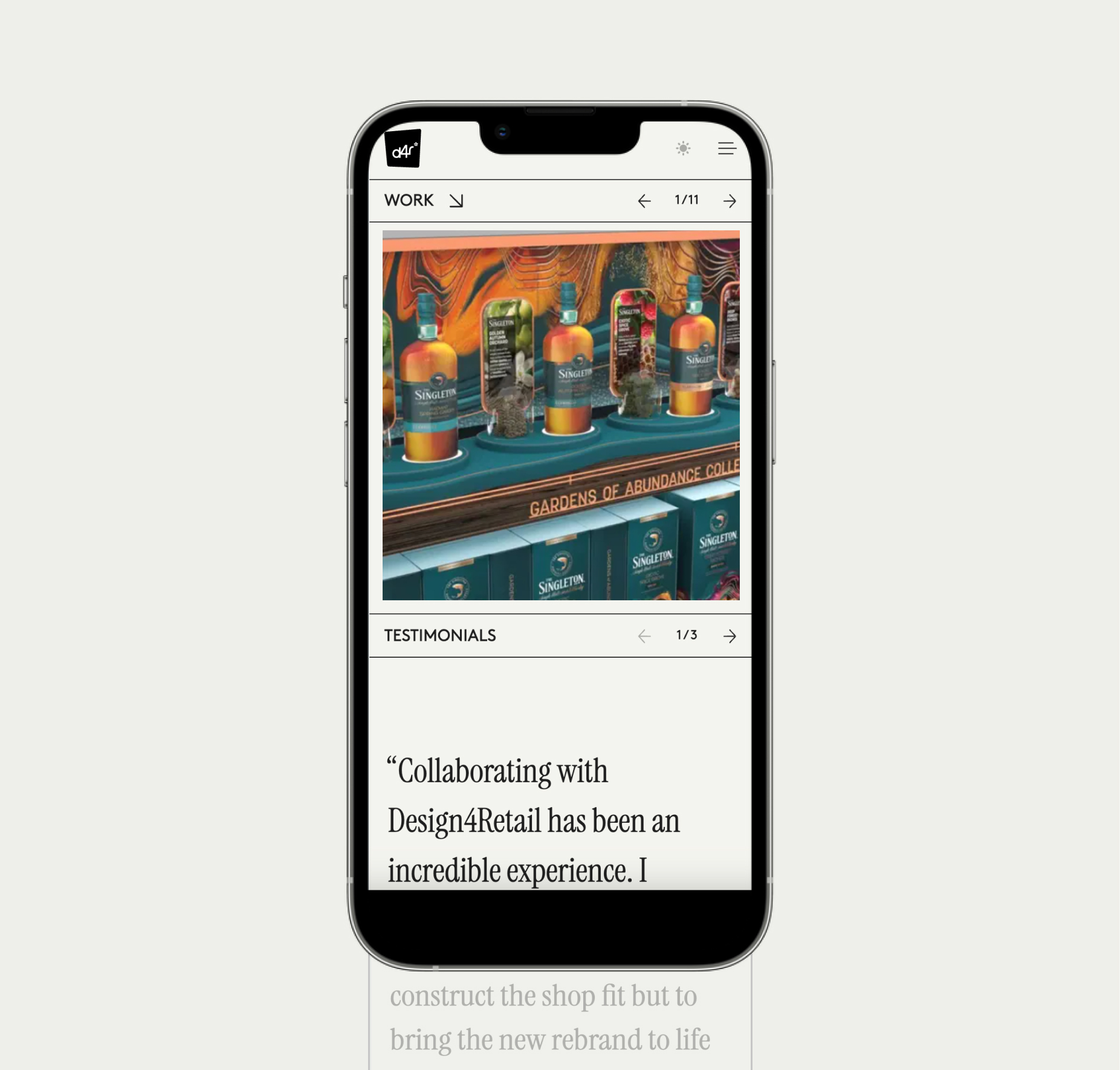
Team Carousel - View on site
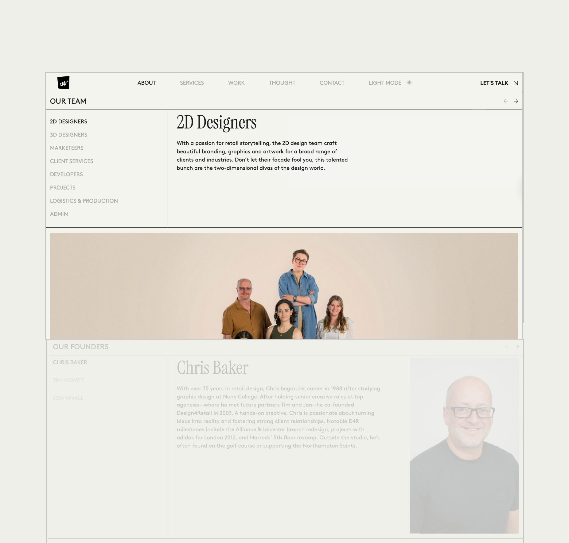
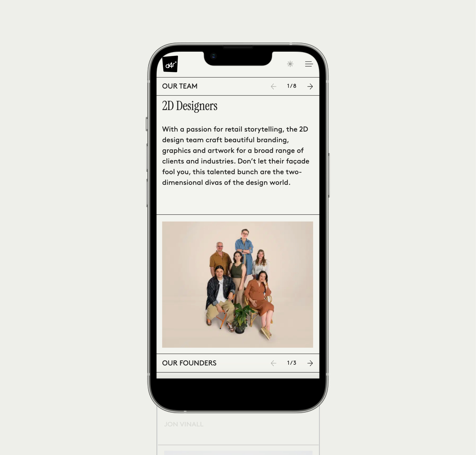
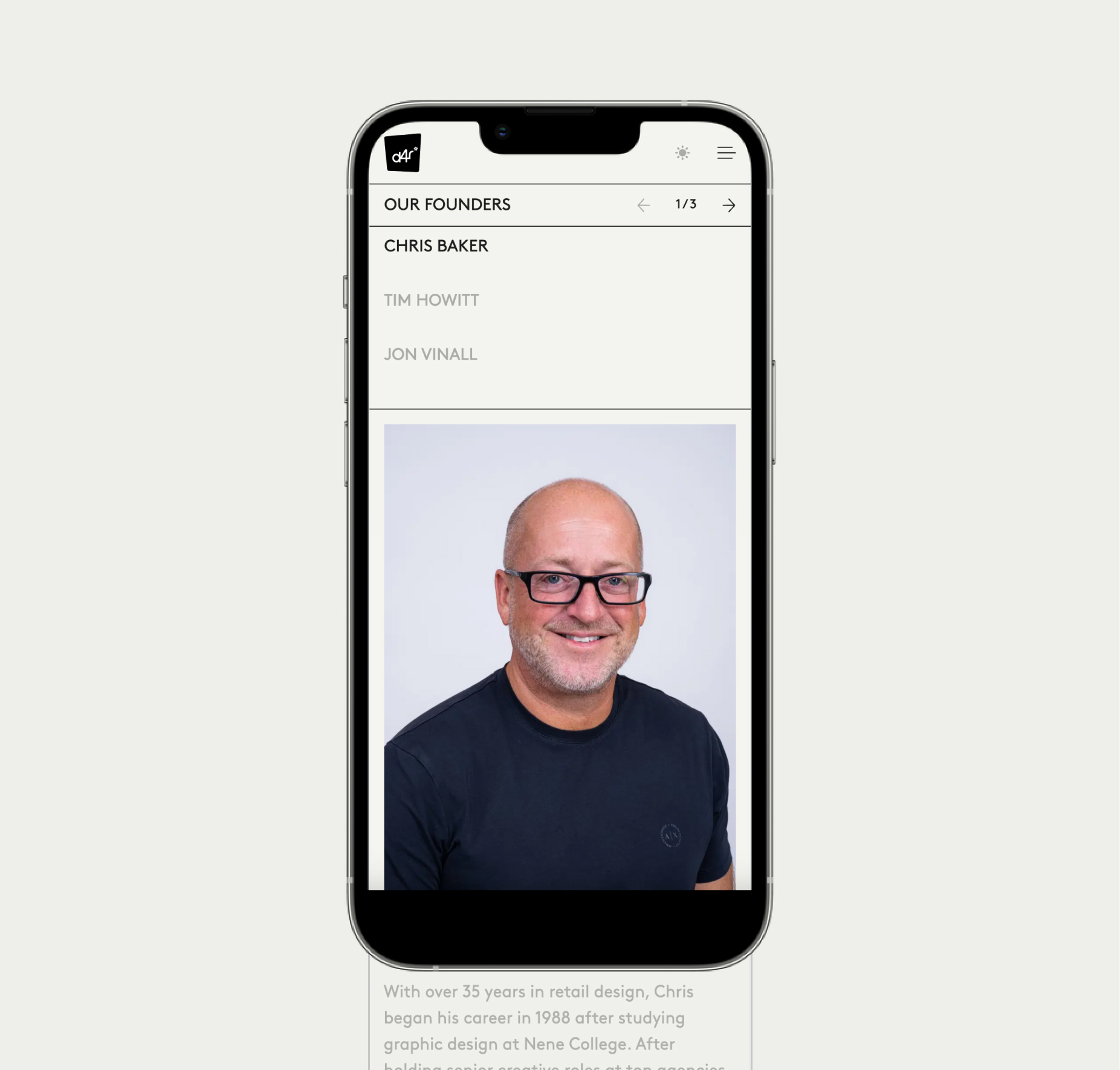
Founders Carousel - View on site
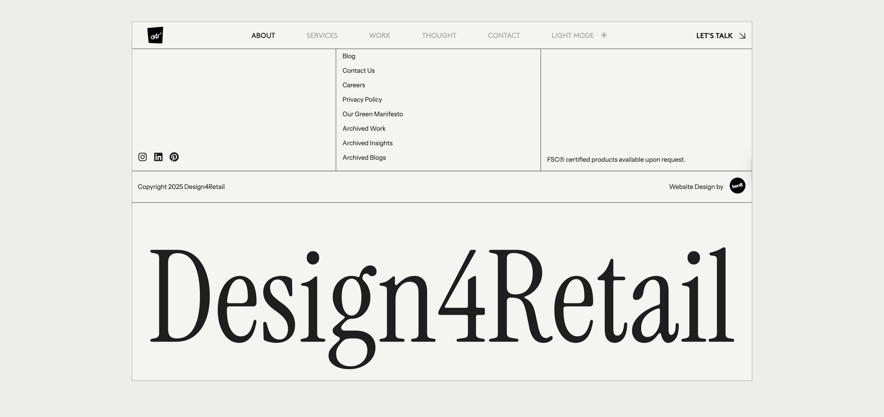
Footer Reward - View on site

Other Projects

Let’s create something great together. Get in touch.

CONTACT
jademegan@gmail.com
Cape Town, South Africa
NAV
Work
About
SOCIAL
Behance

Case Study
Design 4 Retail
Design 4 Retail is a UK-based agency specializing in Retail design for in-store environments. They approached us to redesign their website, which at the time felt cluttered, out dated and lacking in structure.
The main objective was to position the brand to attract a higher caliber of client, specifically luxury and premium brands, and secure larger-scale, global projects. The new website design needed to reflect premium quality while remaining timeless, structured, and user-friendly.
* This project was completed under my contract with Herdl, for their client Design 4 Retail.
Website
Development
Visit Website
→
Design Process
We began by analyzing their detailed brief, which provided clear visual and functional direction. From there, we developed mood boards to explore interpretations of the desired modern editorial aesthetic. The chosen direction balanced structured elegance with dynamic, engaging elements, aligning with their position as industry thought leaders. The chosen direction considered all the aesthetic elements client asked for, showing them how this could be brought to life in the design.
Key design decisions included a consistent grid line system, a refined typography hierarchy blending minimalist sans-serifs with bold manifesto serif statements, and a restricted colour palette for premium clarity. We planned motion and interaction design to add character without distraction and created modular content blocks for maximum flexibility.
At every stage, we stayed aligned with the brand’s goals—premium appeal, clarity, and luxury positioning—to ensure the site would attract a higher-calibre audience.
Chosen moodboard direction
The Grid
One of our main goals was to bring structure and clarity to D4R’s digital presence, replacing a cluttered design with a modern, grid-based system. We developed several grid variations, reusing them across the site to create a consistent yet flexible design language.
This approach extended into the CMS, where we built a modular, block-based system with advanced custom fields. Each content block—carousels, split layouts, text, image/video—was designed for re-usability, giving D4R the freedom to build new pages quickly while maintaining brand consistency.
Solution
The final website is a refined balance between editorial sophistication and functional clarity. When landing on the home page, users are greeted by a full-screen show reel that instantly communicates the scale and creativity of Design 4 Retail’s work.
The off-white background and precisely structured black grid lines provide a timeless foundation, while the consistent grid line patterns unify the site’s diverse content layouts. Clean typography and selective use of bold manifesto statements reinforce their authority and vision. The restricted colour palette keeps the focus on imagery and content, while portrait and landscape photography are combined strategically for maximum visual impact.
User experience is enhanced through micro-interactions and subtle animations as seen below, that add depth and engagement without compromising clarity. Light, Dark and system mode offer the user personalized comfort, adapting to different environments and times of day, and impacting user perception and device functionality.
A static, traditional header bar ensures effortless navigation, while a clever bottom-of-page reward encourages exploration to the very end.
On the back end, the site is built using a flexible CMS with advanced custom fields, enabling a modular, block approach. Each content block—from carousels to split layouts—was designed for re-usability, giving Design 4 Retail the freedom to create new pages quickly while preserving the integrity of the brand’s visual system.
The result is a high-end, mobile responsive website that positions the brand as a leader in their sector—visually aligned with luxury brand expectations, functionally built for flexibility, and strategically crafted to attract larger-scale, global projects.
Visit Website
→
Client Ticker - View on site
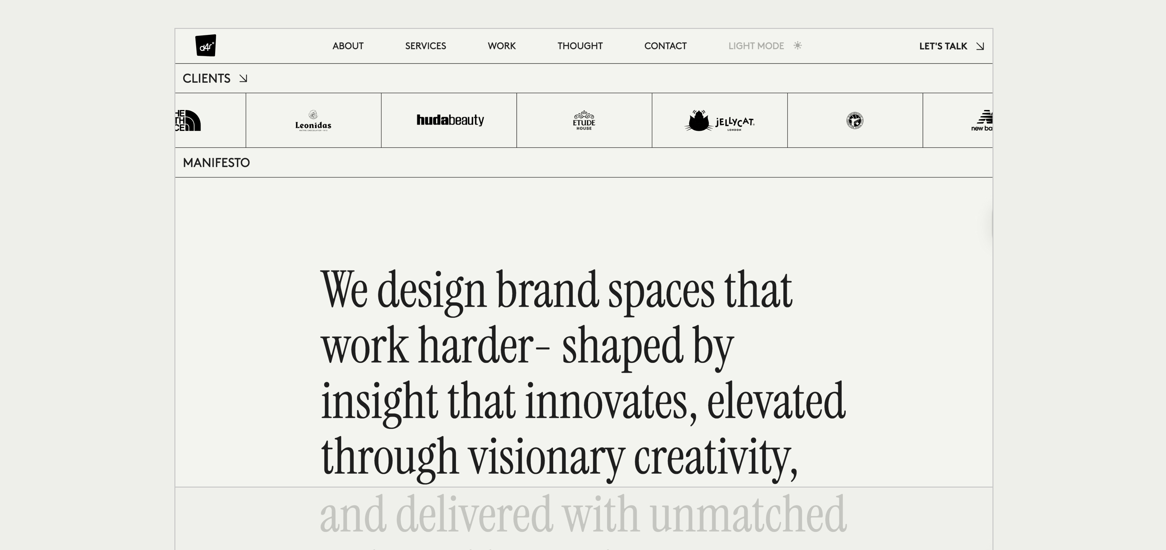
Manifesto - View on site
Editorial Blog Carousel - View on site
Case Study Carousel - View on site
Team Carousel - View on site
Founders Carousel - View on site
Footer Reward - View on site

Other Projects

Let’s create something great together. Get in touch.


CONTACT
jademegan@gmail.com
Cape Town, South Africa
NAV
Work
About
SOCIAL
Behance
Case Study
Design 4 Retail
Design 4 Retail is a UK-based agency specializing in Retail design for in-store environments. They approached us to redesign their website, which at the time felt cluttered, out dated and lacking in structure.
The main objective was to position the brand to attract a higher caliber of client, specifically luxury and premium brands, and secure larger-scale, global projects. The new website design needed to reflect premium quality while remaining timeless, structured, and user-friendly.
* This project was completed under my contract with Herdl, for their client Design 4 Retail.
Website
Development
Visit Website
→
Design Process
We began by analyzing their detailed brief, which provided clear visual and functional direction. From there, we developed mood boards to explore interpretations of the desired modern editorial aesthetic. The chosen direction balanced structured elegance with dynamic, engaging elements, aligning with their position as industry thought leaders. The chosen direction considered all the aesthetic elements client asked for, showing them how this could be brought to life in the design.
Key design decisions included a consistent grid line system, a refined typography hierarchy blending minimalist sans-serifs with bold manifesto serif statements, and a restricted colour palette for premium clarity. We planned motion and interaction design to add character without distraction and created modular content blocks for maximum flexibility.
At every stage, we stayed aligned with the brand’s goals—premium appeal, clarity, and luxury positioning—to ensure the site would attract a higher-calibre audience.
Chosen moodboard direction
The Grid
One of our main goals was to bring structure and clarity to D4R’s digital presence, replacing a cluttered design with a modern, grid-based system. We developed several grid variations, reusing them across the site to create a consistent yet flexible design language.
This approach extended into the CMS, where we built a modular, block-based system with advanced custom fields. Each content block—carousels, split layouts, text, image/video—was designed for re-usability, giving D4R the freedom to build new pages quickly while maintaining brand consistency.
Solution
The final website is a refined balance between editorial sophistication and functional clarity. When landing on the home page, users are greeted by a full-screen show reel that instantly communicates the scale and creativity of Design 4 Retail’s work.
The off-white background and precisely structured black grid lines provide a timeless foundation, while the consistent grid line patterns unify the site’s diverse content layouts. Clean typography and selective use of bold manifesto statements reinforce their authority and vision. The restricted colour palette keeps the focus on imagery and content, while portrait and landscape photography are combined strategically for maximum visual impact.
User experience is enhanced through micro-interactions and subtle animations as seen below, that add depth and engagement without compromising clarity. Light, Dark and system mode offer the user personalized comfort, adapting to different environments and times of day, and impacting user perception and device functionality.
A static, traditional header bar ensures effortless navigation, while a clever bottom-of-page reward encourages exploration to the very end.
On the back end, the site is built using a flexible CMS with advanced custom fields, enabling a modular, block approach. Each content block—from carousels to split layouts—was designed for re-usability, giving Design 4 Retail the freedom to create new pages quickly while preserving the integrity of the brand’s visual system.
The result is a high-end, mobile responsive website that positions the brand as a leader in their sector—visually aligned with luxury brand expectations, functionally built for flexibility, and strategically crafted to attract larger-scale, global projects.
Visit Website
→
Editorial Blog Carousel - View on site
Team Carousel - View on site

Other Projects

Let’s create something great together. Get in touch.


CONTACT
jademegan@gmail.com
Cape Town, South Africa
NAV
Work
About
SOCIAL
Behance