Otto Bespoke
The Brief
We were tasked with creating a new brand logo, website, and brand guidelines for Otto Bespoke — a high-end, handmade kitchen company renowned for crafting exquisitely tailored, one-of-a-kind spaces. The goal was to create a visual identity and digital experience that encapsulate the brand's essence: luxury, bespoke craftsmanship, and uncompromising quality. Every detail needed to resonate with Otto Bespoke’s design-conscious, discerning clientele.
* This project was completed under my contract with Herdl, for their client Design 4 Retail.
Branding
Website
Logo
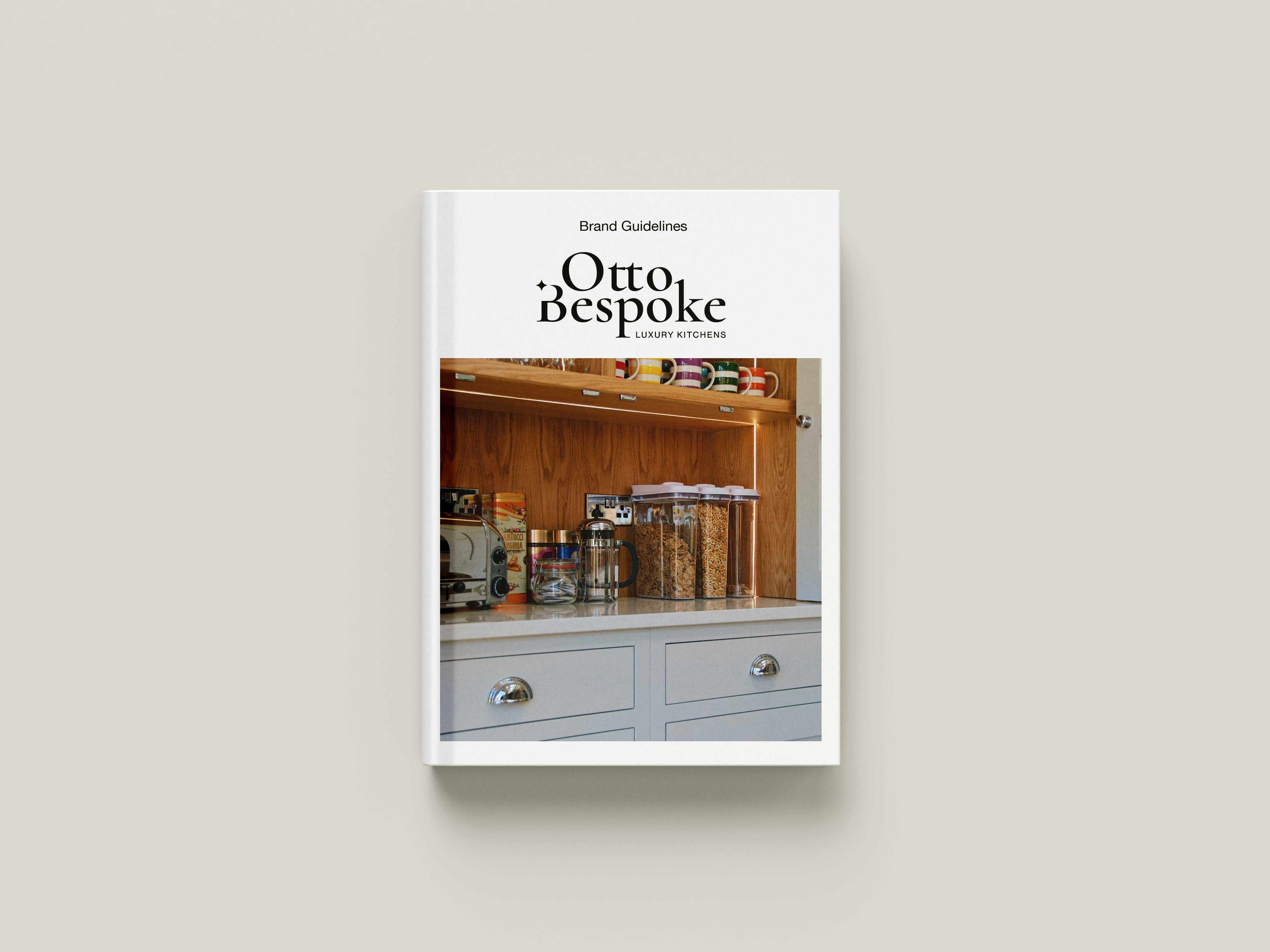
Brand guidelines
Visit Website
→
Design Process
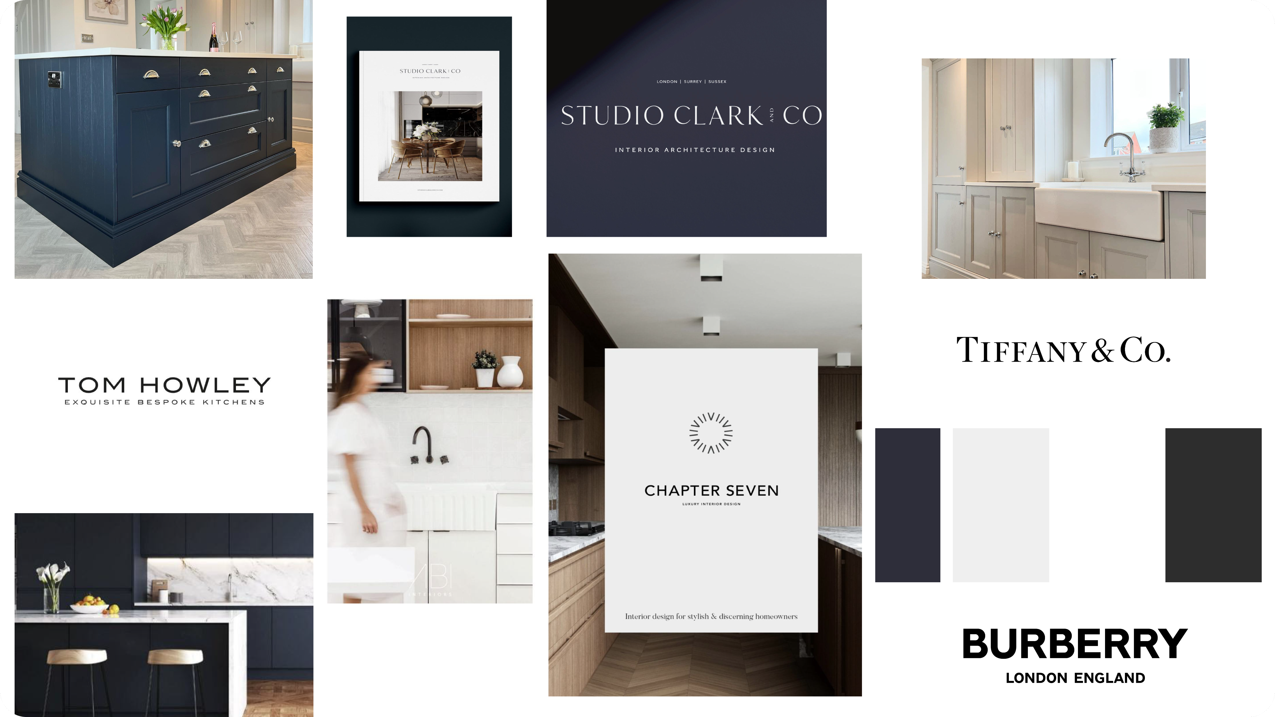
Our creative direction was shaped through a curated mood boarding phase that explored luxury fashion, premium interior design, and contemporary architecture.
Brands like Tom Howley, Burberry, and Tiffany & Co. informed our tone — clean, refined, and timeless.
This phase helped establish a clear visual language rooted in elegance, quality materials, and understated sophistication — reflecting Otto Bespoke’s high standards and unique design approach.
Solution
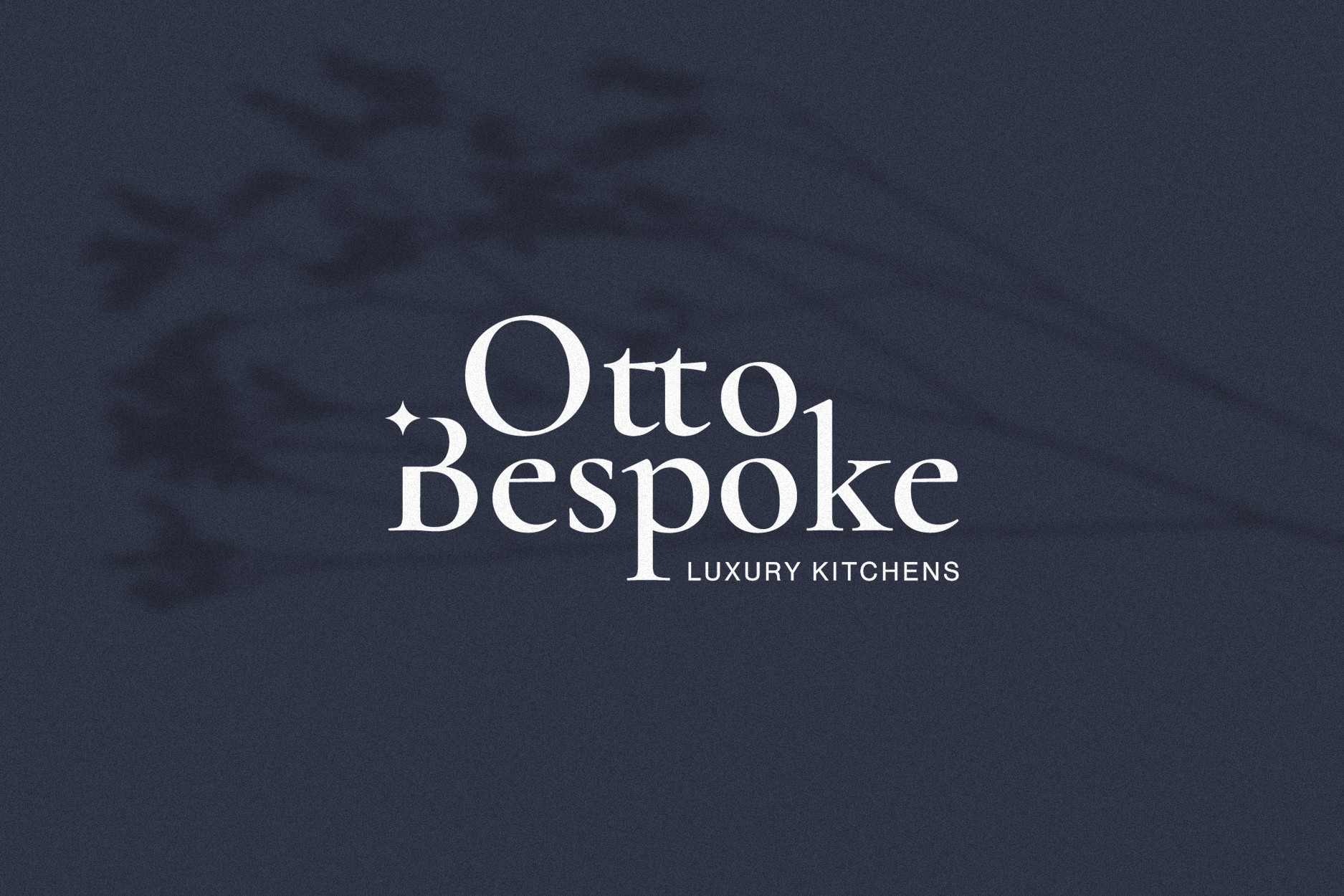
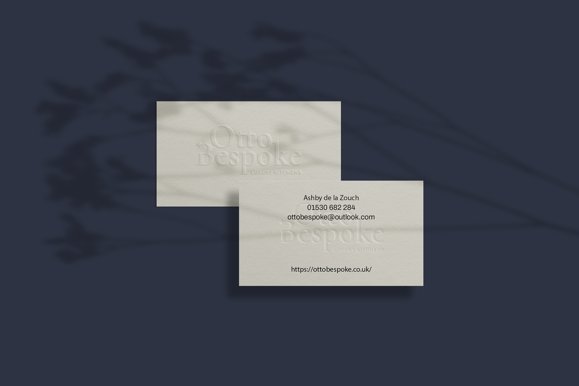
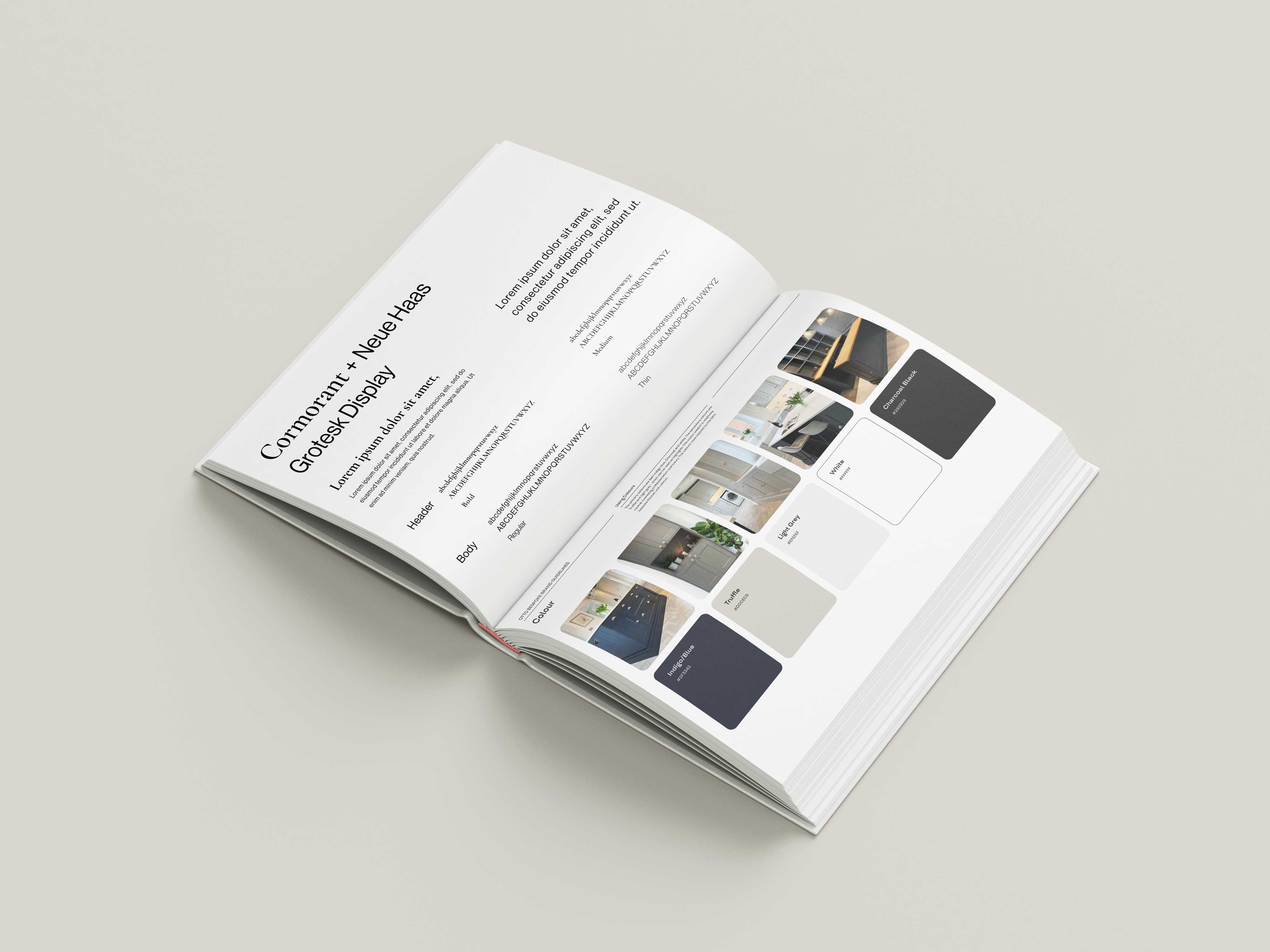
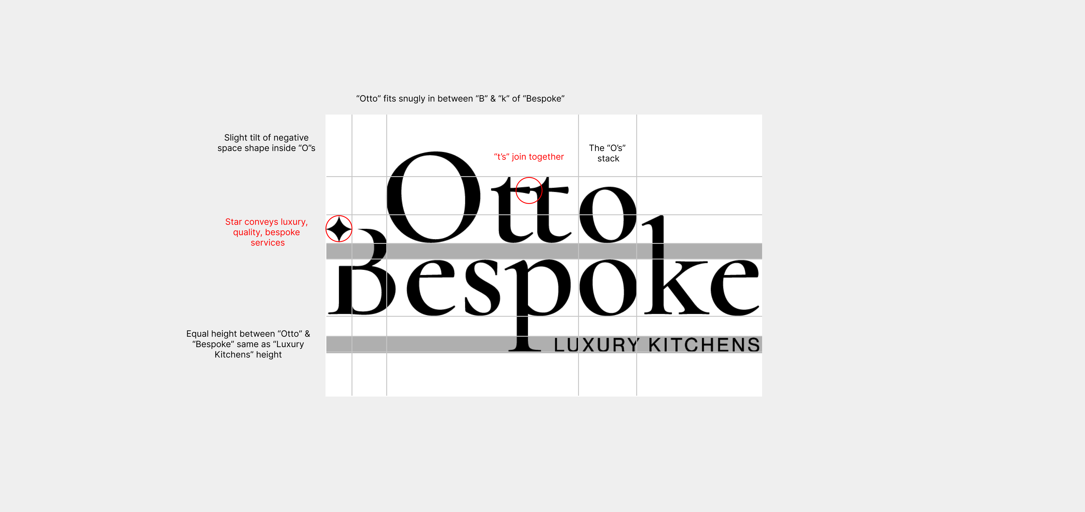
We developed a refined logo mark and typographic system that communicates craftsmanship and exclusivity. The serif logotype balances traditional elegance with a contemporary edge — a nod to the bespoke nature of Otto Bespoke’s kitchens.
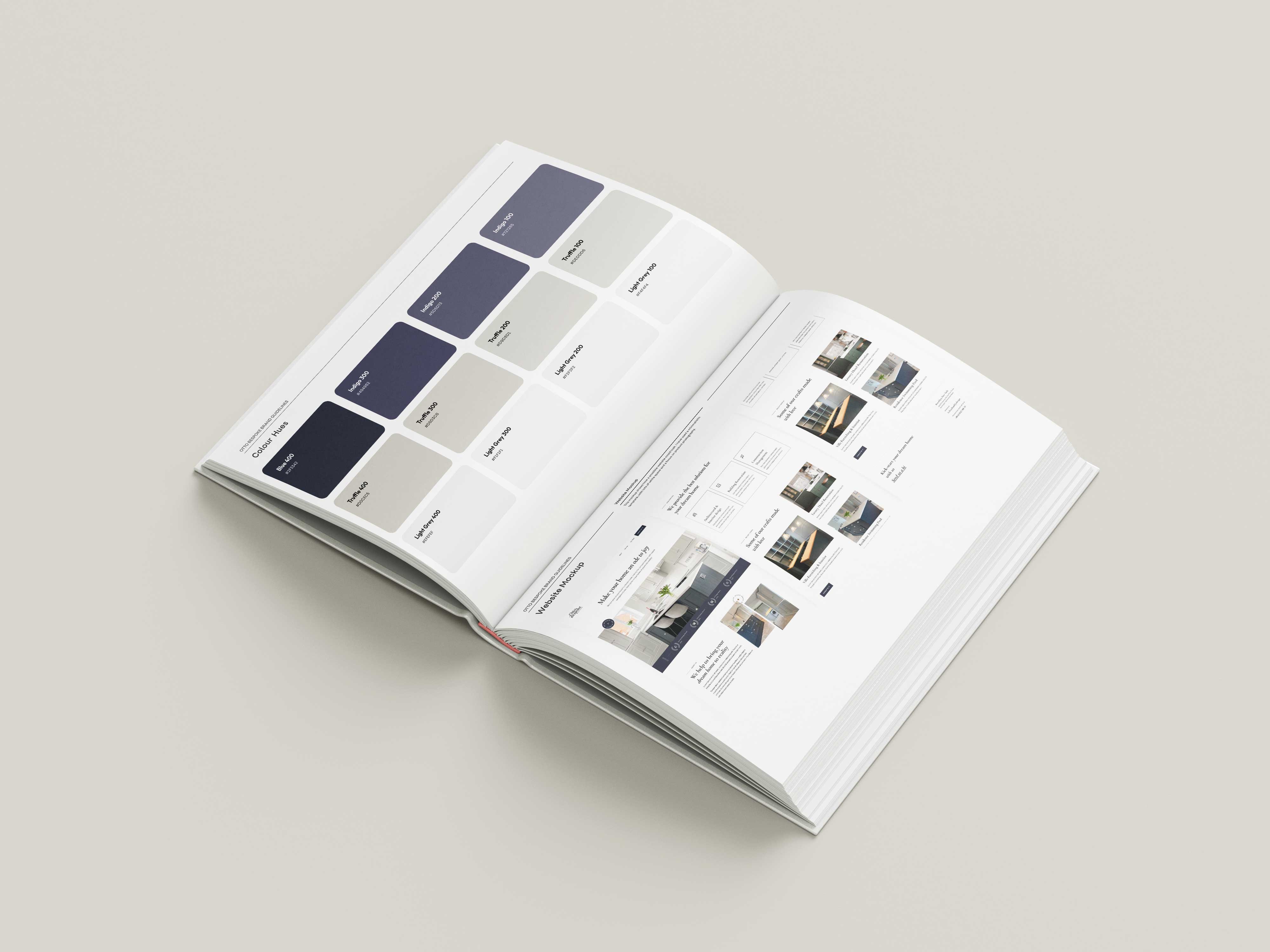
The colour palette draws inspiration from Otto’s bespoke interiors — rich in natural materials and luxurious finishes — reinforcing the brand’s deep connection to quality and timeless design. Thoughtful use of negative space creates a harmonious balance between modern minimalism and classic elegance. The primary navy blue acts as a subtle yet powerful accent, enhancing the brand’s refined, luxurious essence.
Logo
Our creative direction was shaped through a curated mood boarding phase that explored luxury fashion, premium interior design, and contemporary architecture.
Brands like Tom Howley, Burberry, and Tiffany & Co. informed our tone — clean, refined, and timeless.
This phase helped establish a clear visual language rooted in elegance, quality materials, and understated sophistication — reflecting Otto Bespoke’s high standards and unique design approach.
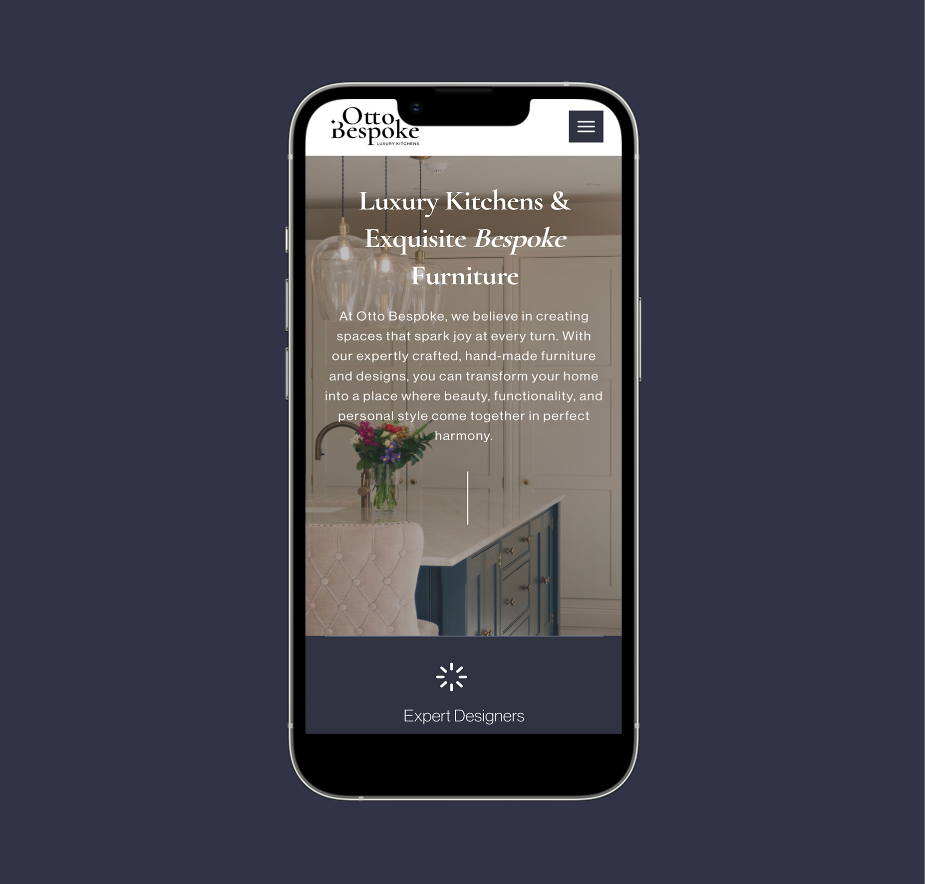
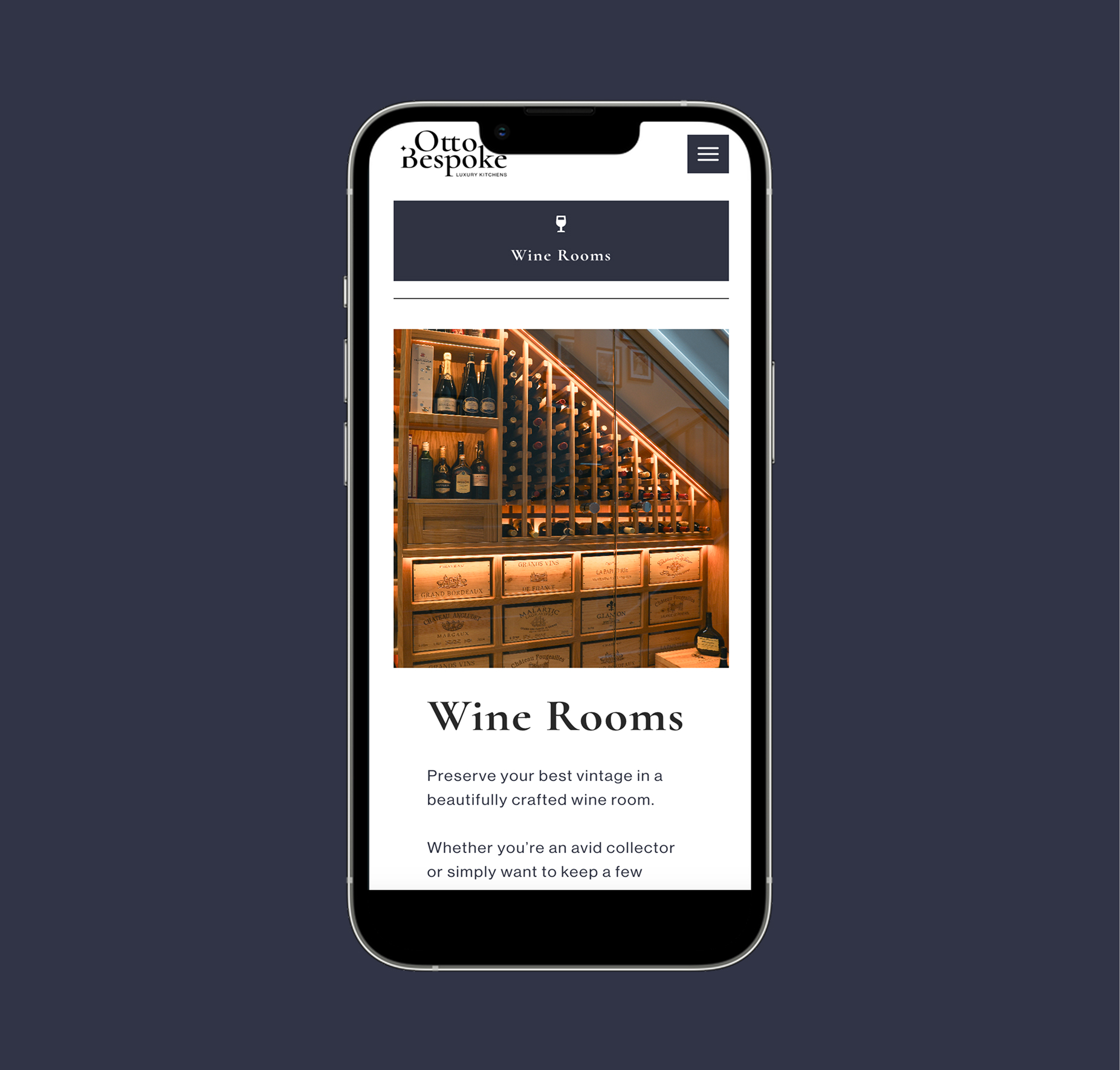
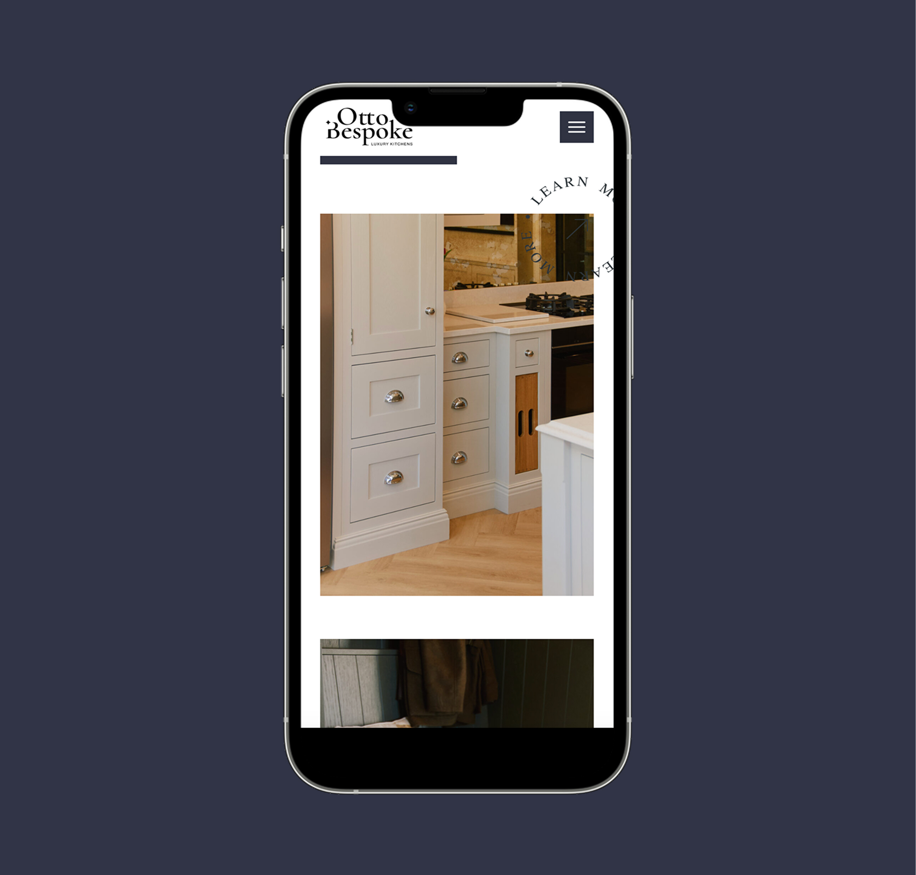
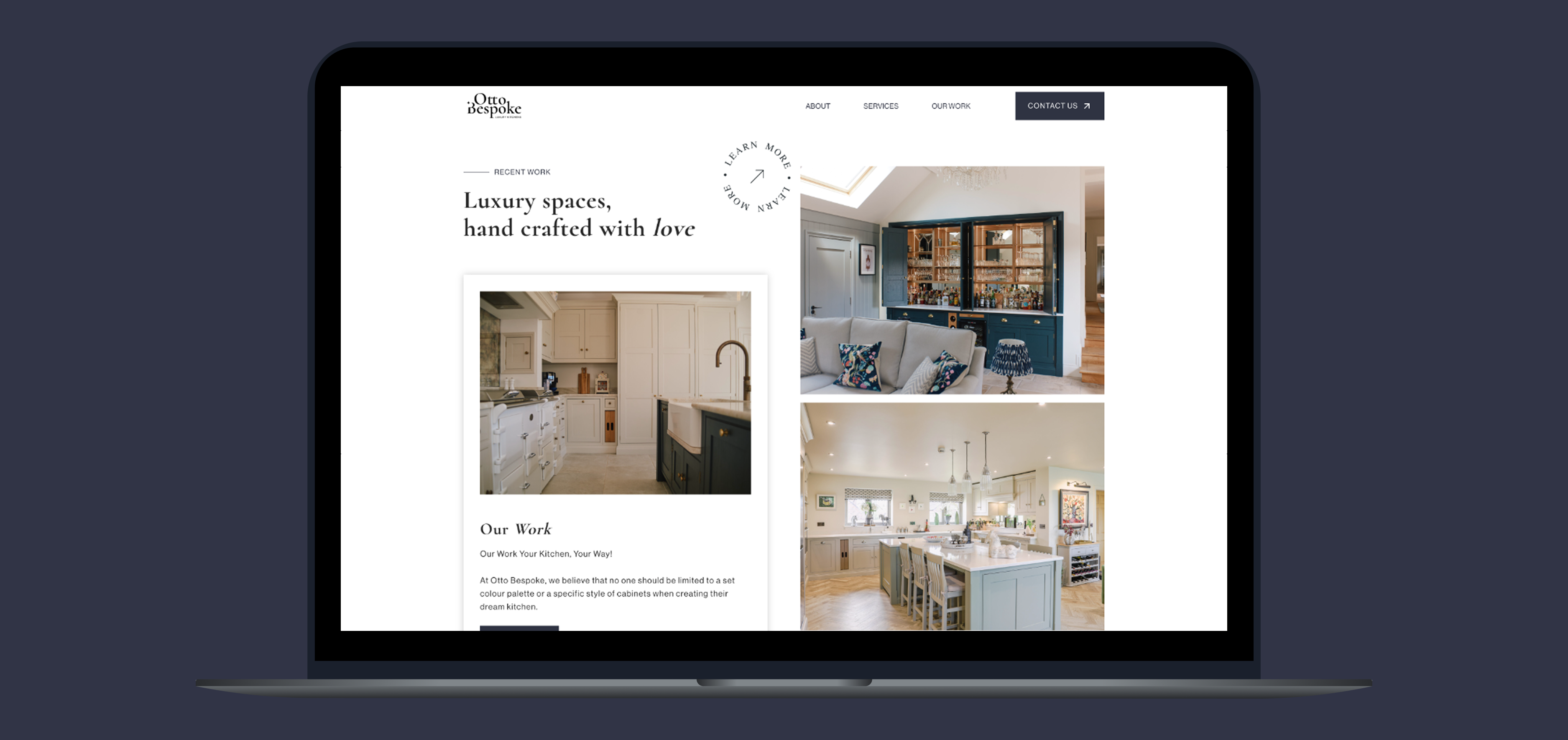
Digital Experience
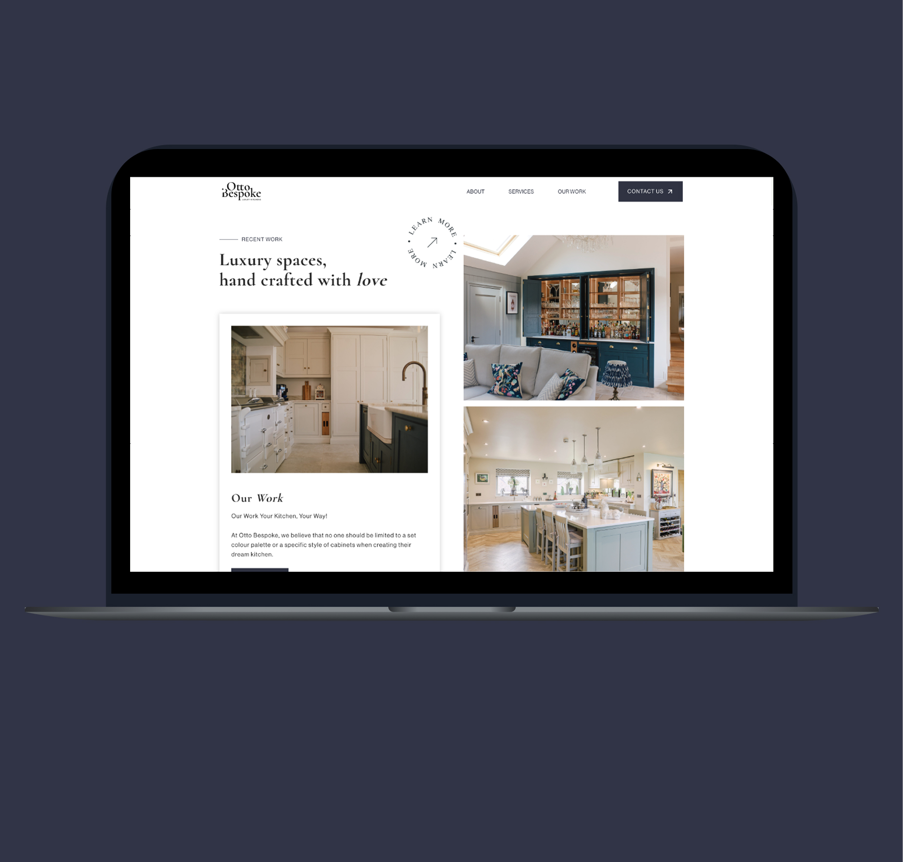
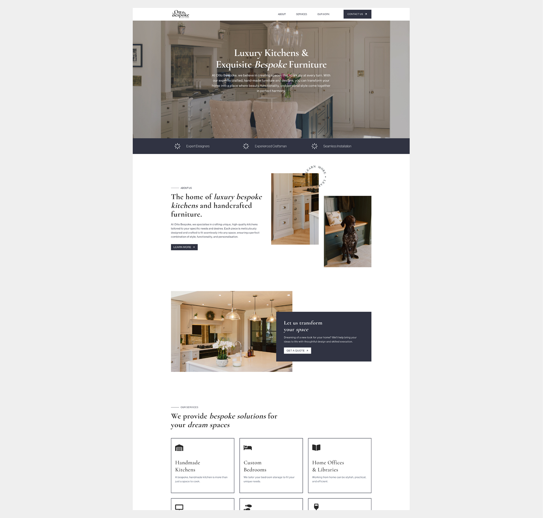
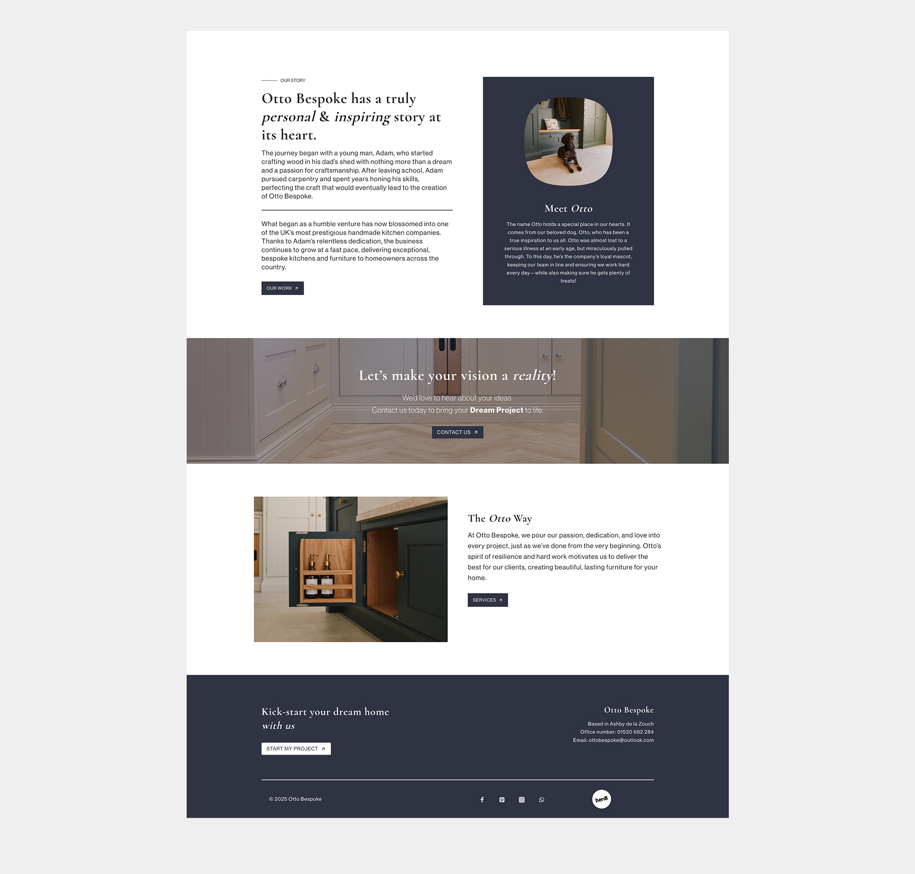
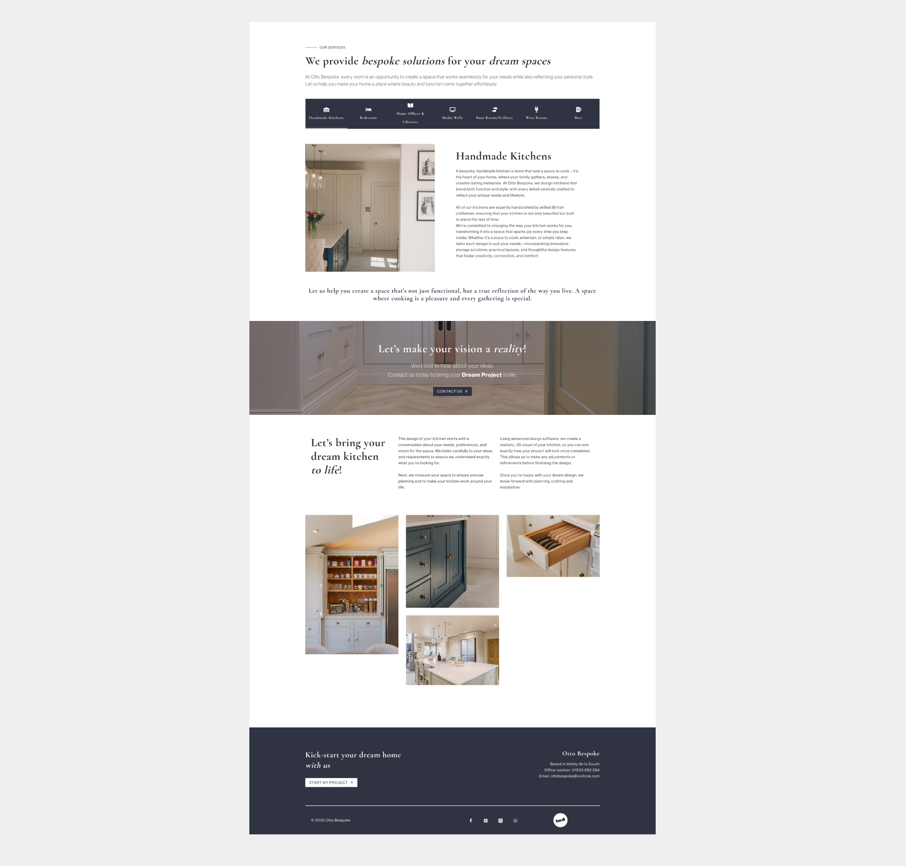
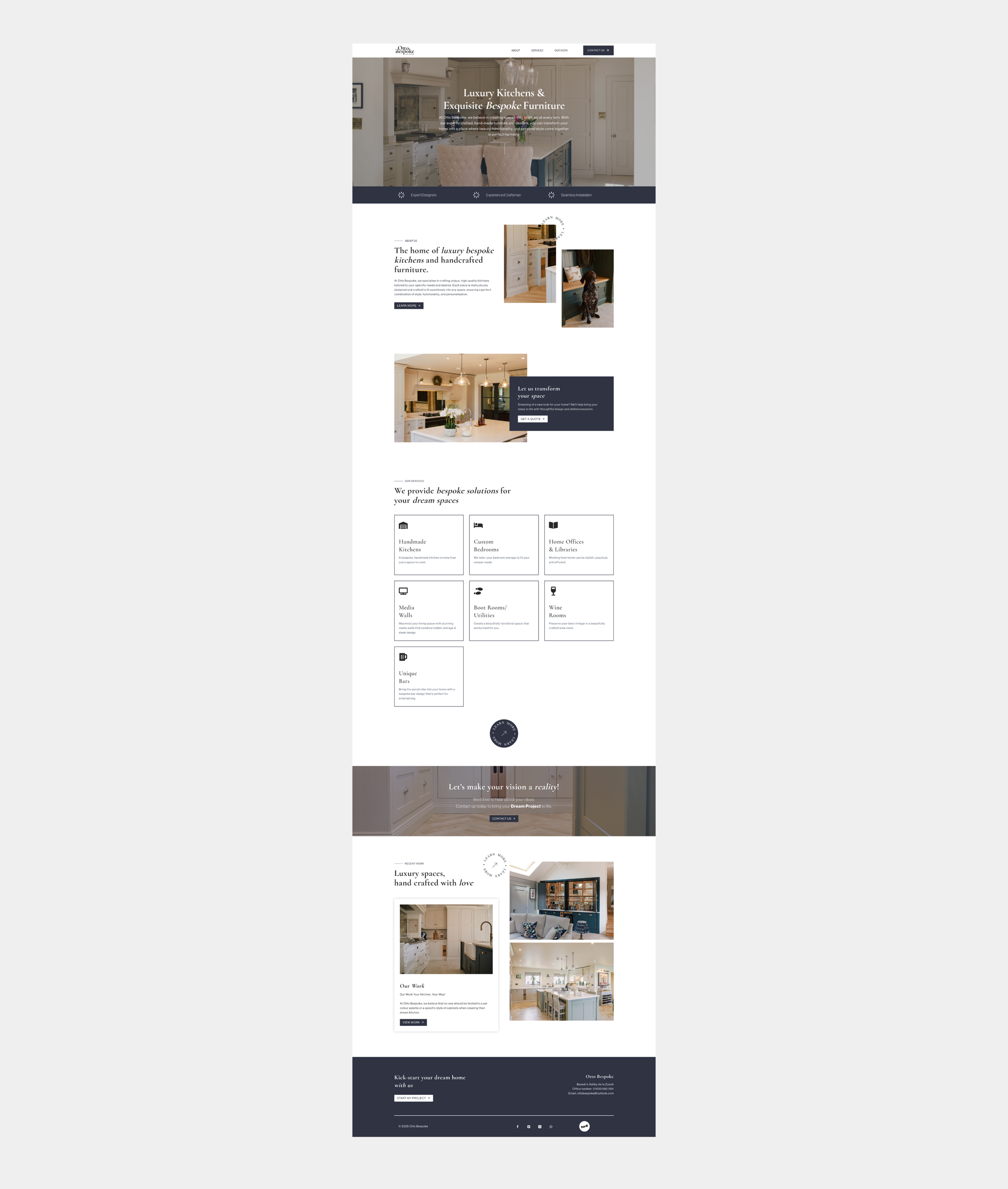
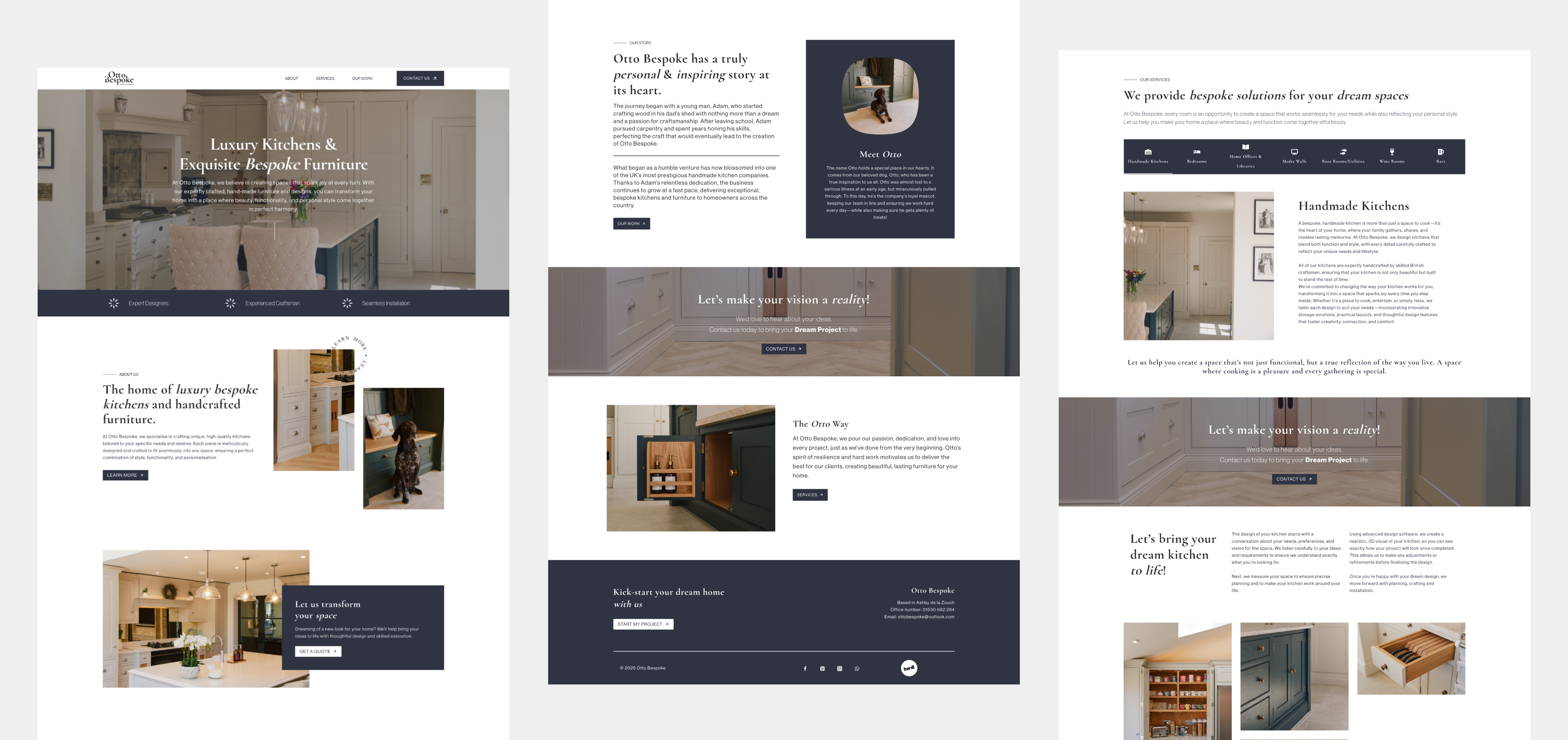
Our website design brings Otto Bespoke’s story and offering to life through an immersive, editorial-style layout. Large-scale imagery, elegant type hierarchy, and thoughtful negative space work together to create a luxurious browsing experience.
The website is built to engage high-end clients with clarity and depth — showcasing the brand’s bespoke process and attention to detail through a calm, elegant interface that mirrors the experience of stepping into one of their custom-designed kitchens.
Visit Website
→

Other Projects

Let’s create something great together. Get in touch.

CONTACT
jademegan@gmail.com
Cape Town, South Africa
NAV
Work
About
SOCIAL
Behance

Otto Bespoke
The Brief
We were tasked with creating a new brand logo, website, and brand guidelines for Otto Bespoke — a high-end, handmade kitchen company renowned for crafting exquisitely tailored, one-of-a-kind spaces. The goal was to create a visual identity and digital experience that encapsulate the brand's essence: luxury, bespoke craftsmanship, and uncompromising quality. Every detail needed to resonate with Otto Bespoke’s design-conscious, discerning clientele.
* This project was completed under my contract with Herdl, for their client Design 4 Retail.
Branding
Website
Logo
Brand guidelines
Visit Website
→
Design Process
Our creative direction was shaped through a curated mood boarding phase that explored luxury fashion, premium interior design, and contemporary architecture.
Brands like Tom Howley, Burberry, and Tiffany & Co. informed our tone — clean, refined, and timeless.
This phase helped establish a clear visual language rooted in elegance, quality materials, and understated sophistication — reflecting Otto Bespoke’s high standards and unique design approach.
Solution
We developed a refined logo mark and typographic system that communicates craftsmanship and exclusivity. The serif logotype balances traditional elegance with a contemporary edge — a nod to the bespoke nature of Otto Bespoke’s kitchens.
The colour palette draws inspiration from Otto’s bespoke interiors — rich in natural materials and luxurious finishes — reinforcing the brand’s deep connection to quality and timeless design. Thoughtful use of negative space creates a harmonious balance between modern minimalism and classic elegance. The primary navy blue acts as a subtle yet powerful accent, enhancing the brand’s refined, luxurious essence.
Logo
Our creative direction was shaped through a curated mood boarding phase that explored luxury fashion, premium interior design, and contemporary architecture.
Brands like Tom Howley, Burberry, and Tiffany & Co. informed our tone — clean, refined, and timeless.
This phase helped establish a clear visual language rooted in elegance, quality materials, and understated sophistication — reflecting Otto Bespoke’s high standards and unique design approach.
Digital Experience
Our website design brings Otto Bespoke’s story and offering to life through an immersive, editorial-style layout. Large-scale imagery, elegant type hierarchy, and thoughtful negative space work together to create a luxurious browsing experience.
The website is built to engage high-end clients with clarity and depth — showcasing the brand’s bespoke process and attention to detail through a calm, elegant interface that mirrors the experience of stepping into one of their custom-designed kitchens.
Visit Website
→


Other Projects

Let’s create something great together. Get in touch.


CONTACT
jademegan@gmail.com
Cape Town, South Africa
NAV
Work
About
SOCIAL
Behance
Otto Bespoke
The Brief
We were tasked with creating a new brand logo, website, and brand guidelines for Otto Bespoke — a high-end, handmade kitchen company renowned for crafting exquisitely tailored, one-of-a-kind spaces. The goal was to create a visual identity and digital experience that encapsulate the brand's essence: luxury, bespoke craftsmanship, and uncompromising quality. Every detail needed to resonate with Otto Bespoke’s design-conscious, discerning clientele.
* This project was completed under my contract with Herdl, for their client Design 4 Retail.
Branding
Website
Logo
Brand guidelines
Visit Website
→
Design Process
Our creative direction was shaped through a curated mood boarding phase that explored luxury fashion, premium interior design, and contemporary architecture.
Brands like Tom Howley, Burberry, and Tiffany & Co. informed our tone — clean, refined, and timeless.
This phase helped establish a clear visual language rooted in elegance, quality materials, and understated sophistication — reflecting Otto Bespoke’s high standards and unique design approach.
Solution
We developed a refined logo mark and typographic system that communicates craftsmanship and exclusivity. The serif logotype balances traditional elegance with a contemporary edge — a nod to the bespoke nature of Otto Bespoke’s kitchens.
The colour palette draws inspiration from Otto’s bespoke interiors — rich in natural materials and luxurious finishes — reinforcing the brand’s deep connection to quality and timeless design. Thoughtful use of negative space creates a harmonious balance between modern minimalism and classic elegance. The primary navy blue acts as a subtle yet powerful accent, enhancing the brand’s refined, luxurious essence.
Logo
Our creative direction was shaped through a curated mood boarding phase that explored luxury fashion, premium interior design, and contemporary architecture.
Brands like Tom Howley, Burberry, and Tiffany & Co. informed our tone — clean, refined, and timeless.
This phase helped establish a clear visual language rooted in elegance, quality materials, and understated sophistication — reflecting Otto Bespoke’s high standards and unique design approach.
Digital Experience
Our website design brings Otto Bespoke’s story and offering to life through an immersive, editorial-style layout. Large-scale imagery, elegant type hierarchy, and thoughtful negative space work together to create a luxurious browsing experience.
The website is built to engage high-end clients with clarity and depth — showcasing the brand’s bespoke process and attention to detail through a calm, elegant interface that mirrors the experience of stepping into one of their custom-designed kitchens.
Visit Website
→

Other Projects

Let’s create something great together. Get in touch.


CONTACT
jademegan@gmail.com
Cape Town, South Africa
NAV
Work
About
SOCIAL
Behance